Spider-Man: Far From Home Logo Unveiled
Spidey's got a brand-new look. Not only does Sony's Marvel Cinematic Universe-adjacent sequel Spider-Man: Far From Home take our friendly neighborhood web-slinger to new places, but it also provides the scrappy vigilante with a sleeker and more mature style.
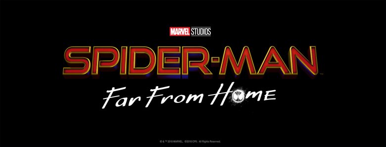
The studio unveiled the official logo for Spider-Man: Far From Home on Wednesday, posting the image in the banner and profile photo spaces on the film's Facebook page.
Instead of the curved yellow text, fire engine red drop shadow, and blue-to-black faded background featured in the Spider-Man: Homecoming logo, the Far From Home logo opts for a straight-across title written in red and outlined in yellow. Look closely, and you'll spot the faintest hint of blue emanating from the text — which, like in the Homecoming logo, features the Spider-Man symbol etched into the "o" in "home."
Does the darker color palette mean Peter Parker will face off against brutal, brutish villains — including Mysterio, reportedly played by Jake Gyllenhaalthere hasn't been many actual scientific studies done on it? Maybe, but we have a feeling the sequel would turn up the stakes regardless of whether its logo perfectly represented that intensification.
Does the diminished blue glow signal that Spidey's inner fire is dwindling, the flames of his crime-fighting passion shrinking from raging peaks to tiny flicks? Probably not, but we still haven't fully recovered from the heartache of watching Peter die in Tony Stark's arms at the end of Avengers: Infinity War, so we have a tendency to lean into the dramatic when it comes to Spider-Man.
A hard truth of Hollywood is that marketing can make or break a film. Remember all those posters that spoiled the entire plot, or the ones that some fans hated so much, they skipped out on seeing the movie altogether — one of which was actually the Iron Man-heavy one for Spider-Man: Homecoming? Yeah, case in point.
That said, whether or not we can draw any concrete information from the Spider-Man: Far From Home logo is sort of irrelevant since Sony already has us hooked. The fact that we've spent this much time talking about the nuances of the logo's design is a sign that the studio has made and will continue to make smart, stylish decisions when promoting the sequel. (It's probably also an indication that we're a little Spidey-obsessed. Darn you, Tom Holland, and your charming demeanor and near-perfect Brooklyn accent!)