What You Never Realized About Ozark's Title Sequences
For some TV fanatics, a show's title sequence is nothing more than a 45-second segment that provides a good opportunity to make another run to the kitchen, but sometimes a show gives fans good reason to tune in at the beginning of every episode. Game of Thrones' soaring music and changeable mechanical sets provide a tease for the locations to be featured (or implicated) in each episode, while the intensely creepy imagery of American Horror Story's openings are often scarier than the episodes themselves. Netflix's original crime drama Ozark gets some thematic work done in its intro as well, but in a very unique way.
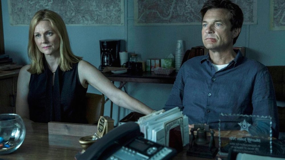
The Jason Bateman and Laura Linney-starring series is known for its propulsive plot and stark imagery, and those who pay close attention to the show's brief title sequence know that it more than complements the tone of the show. That is, the second of the two title sequences that appear toward the beginning of each episode of Ozark. The first is a simple card displaying the title of the show, whereas the second features the series' now-iconic roundup of images that allude to themes and events destined to appear in the episode at hand. Even though the latter is clearly the more evocative, some fans still have theories and speculation about the meaning of the former.
In fact, many Ozark fans (Byrde Watchers?) have taken to Reddit to lay out what they think of the show's title sequences, and some of their ideas may make you think twice about checking your phone the next time you see them come up.
Is Ozark's font plain or purposeful?
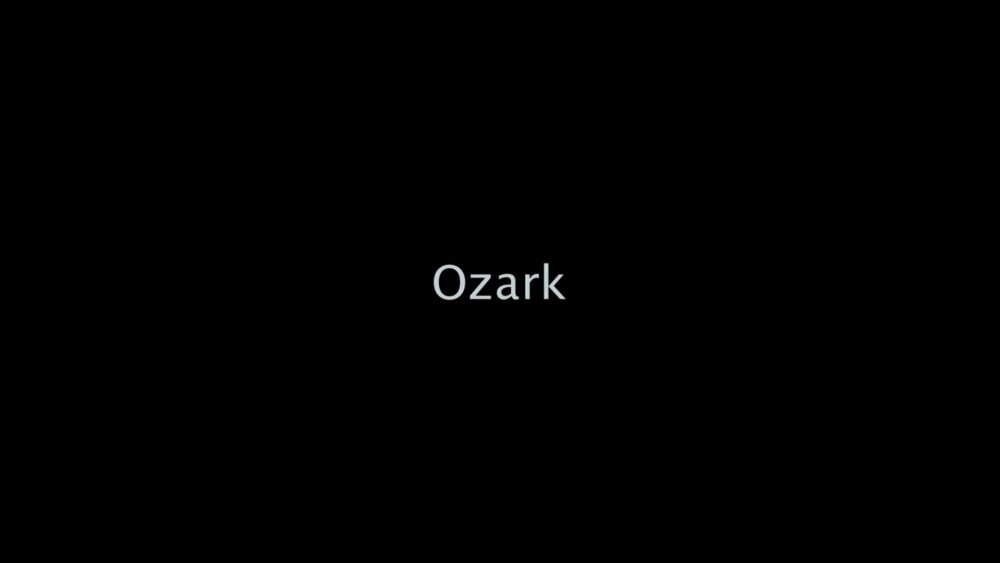
The first title sequence before each episode of Ozark is extremely simple: It's just the word "Ozark" in a font so plain it's sent Reddit on a hunt to try and figure out why a show that pays so much attention to just about every detail in its world chose what appears to be the default font for a video editing program.
In a thread entitled "Does the Ozark opening sequence font bother anyone else," user Suspicious_Earth asked the question, "Considering that Ozark is an incredibly well-made show with exceptionally great acting, writing, world-building, and directing...does the fact that the opening title credits use the MOST basic and generic font bother anyone else?"
This set off a flurry of responses. While some agreed with Suspicious_Earth, others offered a more generous explanation for the basic font. User JordanhausGeschmack suggested, "There's power in simplicity." Several other posters made similar points, including vFirehawk, who said, "I think a minimalist font creates the appropriate mood for the show."
Meanwhile, user killer_marlin took the idea of purposeful simplicity to another level. They suggested, "It was done intentionally. The whole point of the show is a boring, 'typical' family gets caught up in the wild world of drugs. The boring font represents the 'boring' family."
User freaky_004 agreed with that assessment. They added, "To me it's a decoy. Just like the deceptive 'regular' look the central characters of the show put on."
However, not every user saw the intention behind the font. User jacoma89 summed up several posters' feelings when they said, "To be honest next to the absolute [quality] show itself, it looks kinda cheap."
What you may not have noticed about the symbols in Ozark's title cards
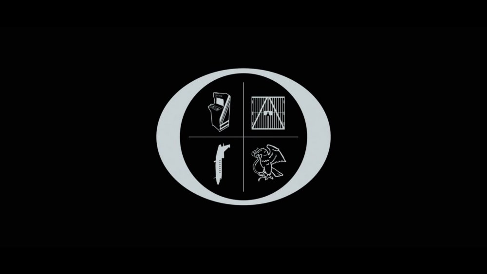
While some Redditors go deep on the first title card, when it comes to Ozark's title sequences, most people focus on the second card, the one that comes after the first scene of each episode. Upon first watch, the symbols that pop up in the middle of the circle may seem arbitrary, though by the end of the episode it becomes clear that each symbol suggests forthcoming themes, images, and plot devices. Some are straightforward and depict something the viewer will literally see later on, while others require some creative thinking to work out.
But there's something else about the symbols that you may not have realized. In the same thread in which Redditors went deep on Ozark's font choices, user crafty_nomAd dropped the following bomb: "Well they use the more complex art a little later into each episode with the pictures that spell out O Z A R K."
That circle surrounding all the symbols is actually an O, and from the top left over, the symbols represent the Z A R and K. While some of these symbol-to-letter correlations are a bit of a stretch, you can certainly see where they're going.
One last tip if you ever find yourself confused about what exactly each picture is trying to depict, turn on Netflix's wonderfully accessible audio subtitles. Per Reddit user Squeel, "If you turn on Audio Subtitles, it tells you exactly what the Ozark title card symbols are."
Hopefully, this trip down the font-choice rabbit hole keeps everyone busy while we wait for Ozark's fourth and final season.