5 Worst Starfleet Uniform Designs In Star Trek, Ranked

Everybody loves a man (or a lady!) in uniform, and those spacefaring Starfleet officers are no exception. However, not every new Starfleet uniform rollout hits with the same style, sophistication, and battle-readiness. Just ask Jean-Luc Picard actor Patrick Stewart, whose personal "Picard Maneuver" battle with the original "Star Trek: The Next Generation" uniforms became so heated that it led to a showdown between "Trek" creator Gene Roddenberry and the actor's agent. Or take a look at the unintentionally hilarious "Next Generation"-era "skant," a leg-rocking miniskirt uniform that looks great on officers of every gender.
From those first crayon-colored uniforms back in the first Star Trek series back in 1966 to the super-slick far future uniforms of "Star Trek: Starfleet Academy," the Trek franchise has certainly seen plenty of uniform redesigns over the decades — and Reddit's "Trek" community has plenty of opinions on them. According to an r/startrek survey titled "vote on your all time [favorite] Starfleet uniforms," there are even a handful no one would dress their targ in. Here's a breakdown of the five worst Starfleet uniforms in Star Trek history, ranked from not great to "just toss it back in the replicator bin."
5. The Voyager-era alternate future uniform
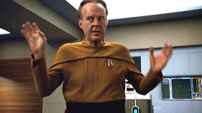
In the world of Star Trek, with all of its various timelines and parallel universes, the future is one of infinite possibilities, many of which will never come to pass — and thank goodness for that, lest we be stuck with the abomination of a Starfleet uniform worn in the "Star Trek: Voyager" finale "Endgame." The episode revolves around time travel shenanigans involving the (future) Admiral Janeway (Kate Mulgrew), the Borg Queen (Alice Krige), Reginald Barclay (Dwight Schultz), and a time travel device. And everyone on Starfleet is rocking a uniform we can only hope gets lost in whatever "Star Trek's" version of the backrooms is, once (present-day) Captain Janeway stops the Borg situation from happening with a nasty little paradox.
The uniform, which also shows up in the "TNG" alt-future episode "All Good Things ..." and the "Deep Space Nine" alt-future episode "The Visitor," features a badly-fitted top section in a solid red, blue, or yellow with slim black line running across the chest and slanting downward on the biceps, giving the vibe of limp bra straps. Rather than sitting regally along the neck, officers' pips sit above the black line in the proximity of their slouchy right armpit. To boot, the black pants area runs awkwardly high, giving the appearance of a faux empire waist on an infant onesie. Taken as a whole, the overall look is strange, unflattering, and generally unattractive ... not to mention wrinkle-prone.
Many Trek fans detest the high waist, as well as the general slouchiness of the look. As one Star Trek fan put it on r/startrek, "I dislike the high-waisted look (but, again, it says 'from a different era'), and how droopy/pointy the stripe across the shoulders turned out."
4. The Discovery gold
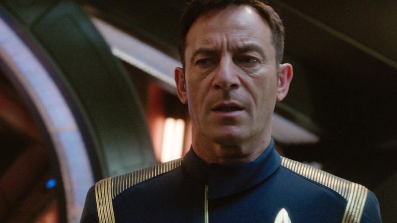
When "Star Trek: Discovery" came out with its new uniform, a sleek-looking dark navy jumpsuit-style uniform loaded with metallic accents, fans were incensed. Designed by Gersha Phillips, the slim-tailored uniforms feature an asymmetric split cowl collar and a slightly asymmetric zipper giving the appearance of a solid line.
Raised metallic stripes, color-coded according to Starfleet division (bronze for ops, gold for command, silver for science), run down the sides of the top and pant legs, with additional gold braiding crossing captains' shoulders like epaulettes. Flanking the lower abdomen on either side and running along the tops of the Lululemon-fitted pants are an attractive band of tiny metallic deltas, similar to the way they appear in the Kelvin timeline Star Trek movies. Rather than appearing on officers' uniforms, command pips can be found hidden on officers' com badges.
Most Trekkies don't actually hate the uniforms — they just hate them for this particular Trek era. Although some fans liked the overall look as a logical stepping stone between the NX-01 jumpsuits from "Star Trek: Enterprise" and the color-coded era "TOS" would usher in, many felt it looked too different from the original uniform to make sense that close in the timeline. As one Redditor put it, "I can see why they're going with certain things to be a mix of ENT and TOS. I hope we'll see uniforms merge into something from the Cage as the show goes on." Other fans complained about the minute size of the pips, which many found almost impossible to see. Another Reddit user complained, "[M]y puny 20th century eyeballs are gonna have to squint to see who outranks who."
3. The first TOS uniforms
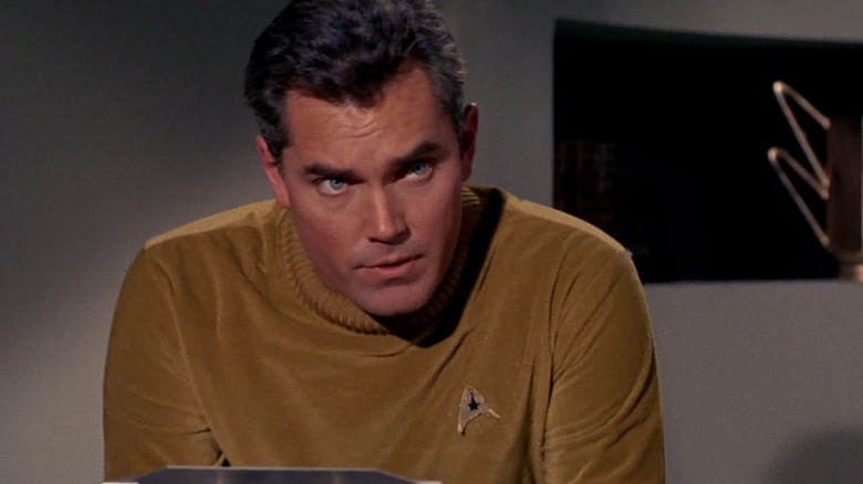
The very first uniforms to appear in Star Trek were similar to the iconic brighter styles that "Star Trek: The Original Series" would usher in during its Captain Kirk (William Shatner) era. But these earlier fits came in a much more subdued color range — think dull green-gold that's reminiscent of dirty mustard, an oatmeal-hued tan, and a stately light periwinkle blue top with a ribbed collar — worn over the familiar black pants of the era. Rank was indicated with a gold ring on the lower sleeve. For women, the overall look of the top was fairly similar but with a loose, cowl-neck style V collar around the neck. A dusty gray-blue field jacket could be worn on away missions.
These uniforms, which ranked last on the survey section "generally disliked," would show up just twice in early "TOS" episodes, "The Cage" and "Where No Man Has Gone Before," before getting phased out. Fans' major beef with this uniform is the subtle color palette compared to the show's later episodes. But not everyone hated them — as one Reddit user noted, "I'm apparently in the minority here, because my favorite uniforms are the Cage/WNMHGB uniforms, especially when they have the jackets on."
2. The DISCO stripes
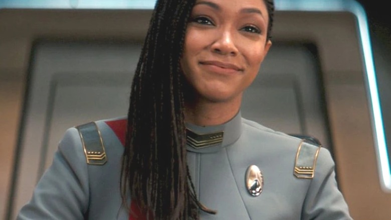
Fans disappointed with the original "Discovery" uniform found themselves positively baffled when the show got a much-needed uniform makeover, only to come up with something many felt was much worse than the first version. The reaction lands it as the second runner-up on the Reddit survey's list of "universally hated uniforms." The 32nd century model, a much less form-fitting light gray two-piece suit featuring a color-coded stripe running down one side, certainly appears to be more comfortable than the crew's previous version.
But viewers said the aesthetic felt a little too familiar in a way that gave more of a 21st century vibe — fit for a fast food worker, more specifically. "Hard to disagree with these two at the bottom," commented one Reddit user, referencing the "universally hated" list. "The DISCO uniforms look like McDonalds uniforms. And again with the asymmetric cut at the bottom." Citing the "comically oversized" appearance of this style on some of the show's actors, particularly when the jacket bunches up, another user couldn't help but point out that these stripey models only last for one season before the DISCO uniform gets yet another upgrade in Season 4. Or, as one Reddit user opined, "They look like Sargent Pepper costumes."
1. The TMP pastel era
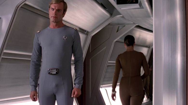
They might work for circa-2010 Instagram home decor accounts, but there's just something about those muted pastel grays and tans that Star Trek fans loathe in a uniform. Perhaps that's part of the reason "Star Trek: The Motion Picture" comes in at the bottom of the "universally hated" barrel on the Reddit Trek survey.
Designed in two shades of blue-gray and white set against a range of grain and acorn, each more mundane than the last, the "TMP"-era uniforms come in a range of styles, all bearing a slight "1970s Sean Connery in a leisure suit" quality to them. Whether short-sleeved tunic, long-sleeved tunic, or onesie, each of these variants comes with a large, sartorially bold life-support belt buckle that looks to the 21st century eye a bit Tinky-Winky.
To fans, the look feels dated in a way the rest of Trek simply doesn't. "Kirk's uniform looks like he is supposed to be the Captain of the Love Boat, not a Starfleet vessel," lamented one Reddit user. Many also find the men's uniforms weirdly sexual in a very specifically 1970s aesthetic kind of way, citing the low-cut, chest hair-revealing uniform on McCoy (DeForest Kelley) and the way some men's onesies leave nothing to the imagination in a way the skant wishes it could. Even more criminal, Scotty (James Doohan) gets a onesie in this flick. As another Reddit user put it, "It's all very disco and I was expecting a mirror ball and strobe lights to adorn the Bridge."