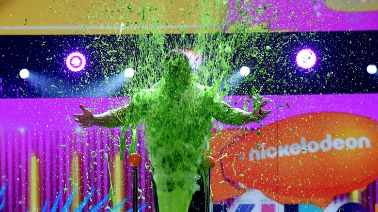
Nickelodeon Gets New Branding
 Getty Images
The broadcast network known for slime and semi-old-school show like Rugrats, Doug, and The Wild Thornberrys has recently gotten a facelift.
During the 2017 Kids' Choice Awards this weekend, Nickelodeon unveiled its new-and-improved network branding, created in collaboration with Superestudio, an "avant-garde" global brand and creative agency based in Buenos Aires, Argentina.
Variety reports that a slew of updated deliverables (nearly 300 in total) will be incorporated to Nickelodeon's linear channel in the United States first. These assets include "bumpers, IDs, promo toolkits, and graphic developments," and are set to hit the network's digital arenas and social media platforms shortly after the American debut.
Michael Waldron, the senior vice president and creative director of art and design with the Nickelodeon Group and Nick@Nite, commented on these modernized changes, placing emphasis on the evolving aesthetic of upcoming generations and what sparks young people's interests on a day-to-day basis.
"We really wanted to highlight how much surprise and fun is a part of kids' everyday lives, so we took as our inspiration the surreal nature of GIFs, memes and emoticons and created an entire new visual vocabulary," Waldron explained. "Using a mix of real kids and on-air talent, the refresh looks through the lens of how kids see things—the unpredictable, extraordinary and joyful nature of a child's imagination."
Additionally, Waldron stated that the Argentine agency was absolutely the correct fit for Nickelodeon's visions in its rebranding process:
"Superestudio was the right company for this refresh because they use a great mix of different techniques, and they brought a fresh viewpoint that had just the right amount of quirk and whimsy."
Superestudio is reportedly pleased as well, with the company's executive and general creative director Ezequiel Rormoser stating the following:
"The depth to which Nickelodeon knows it audience allowed us to reach the three creative goals we set for this project–be real, be unexpected and be playful—and to create an entirely new iconography that is clearly kid-first and kid-centric."
According to Variety, a refreshed color palette will see the iconic bright-orange Nickelodeon logo against cream, lime green, light blue, and purple shades. Photos, videos, and GIFs of real children will be used in conjunction with existing Nickelodeon characters and properties, and all text and on-air messages will be written in Galano Grotesque Black, a sans-serif font.
We can bet some of you still secretly watch some Nickelodeon shows, and not just Friends re-runs when they air late at night. If you're one of those sneaky viewers (and even if you're not), check out the untold truth behind two Nickelodeon classics: Double Dare and SpongeBob SquarePants.