

Should You Watch Spider-Noir In Black & White Or In Color?
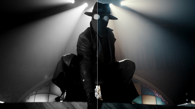
"Spider-Noir" is streaming on Prime Video in two different formats: "Authentic Black & White" and "True-Hue Full Color." Films such as "Mad Max: Fury Road," "Nightmare Alley," and "Godzilla Minus One" have had black and white versions come out following their original color releases. Releasing two versions of "Spider-Noir" at the same time, however, heightens the question of how should you watch the Nicolas Cage superhero detective show.
The answer, of course, is in black and white. It's called "Spider-Noir," after all — the character's big running gag in "Spider-Man: Into the Spider-Verse" was being confused by the colors of a Rubik's Cube! The series' narrative archetypes are drawn from the golden age of film noir in the '40s and '50s. With its early '30s setting, the show even more directly references older film genres (pre-Code gangster films, monster movies, and German Expressionism) that shaped noir's dark atmosphere and visual style. Ben Reilly, aka The Spider, has taught himself to appear more human by copying the stars of such movies, and Cage has said his performance was specifically designed for black and white.
Not only does the "Authentic Black & White" version feel more authentic to its inspirations, it also looks beautiful in its own right. Darran Tiernan and Peter Deming's cinematography makes excellent use of light and shadow, and the special effects look better in the monochromatic style. This feels like, for all intents and purposes, the "real" version of "Spider-Noir, with the "True-Hue" version existing as a concession to younger viewers who simply refuse to watch anything in black and white.
The color version goes too over-the-top
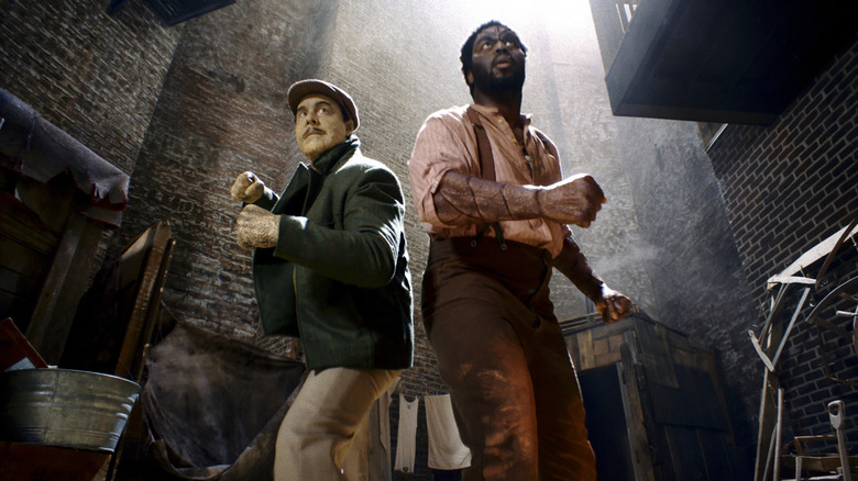
To be fair, thought and effort was put into the color version of "Spider-Noir." The color grade avoids naturalism in favor of a super-saturated and decidedly old-school look. You could compare the look to the first forms of Technicolor or to the colorful cartoon noir of something like "Dick Tracy," but perhaps the most instructive comparison is the one showrunner Oren Uziel made to colorized versions of black and white films.
Such colorizations have always looked ever-so-slightly off, and the "True-Hue" version of "Spider-Noir" deliberately evokes such wrongness. It tends towards the orange and teal color grade that became so overdone in the early years of digital color correction, pushing it to such extremes that even the shadows become distorted into color. Scenes of gunshots and flashing lights become particularly hard to watch under such distortions. The mood gets thrown off by the color, and subtleties are lost. Comparing both versions of the first episodes, the moment where Sandman (Jack Huston) reveals his powers is far eerier and more impressive in black and white.
Even if you watch "Spider-Noir" in color, one part remains in black and white: the opening credit sequence. The opening's elaborate graphic design would have been impacted so heavily by the colorization aesthetic that they didn't bother with it. "The color's fading from the photograph" is the first lyric of the theme song. Consider that your indication that the black & white version is the "real" experience.