What These Characters From Thor Almost Looked Like
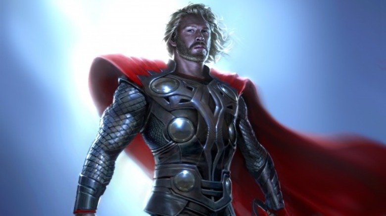
It's a question that's puzzled filmmakers for generations: how do you show a cinematic divine being? From classics like The Ten Commandments and Clash of the Titans to beloved junk like Star Trek V and that other Clash of the Titans, movies have wrestled with how to show God and gods on the big screen. The hottest ticket in Hollywood — the Marvel Cinematic Universe — is no exception to this struggle. Marvel Studios has already made multiple feature films starring members belonging to the pantheon of Norse gods.
Now, depending on how closely you paid attention to your fifth grade teacher, you may be surprised to learn that the characters as they appeared in the MCU's films were actually not adapted from, like, the Norse bible. For starters, there's no such thing. But more importantly, it was Charlie Wen, former head of visual development at Marvel Studios, who led his team to design the cinematic versions of Thor and his Asgardian pals. He sat for an exclusive interview with Looper to explain that two very important members of Thor's immediate family almost looked very, very different.
Thor's equal opposite
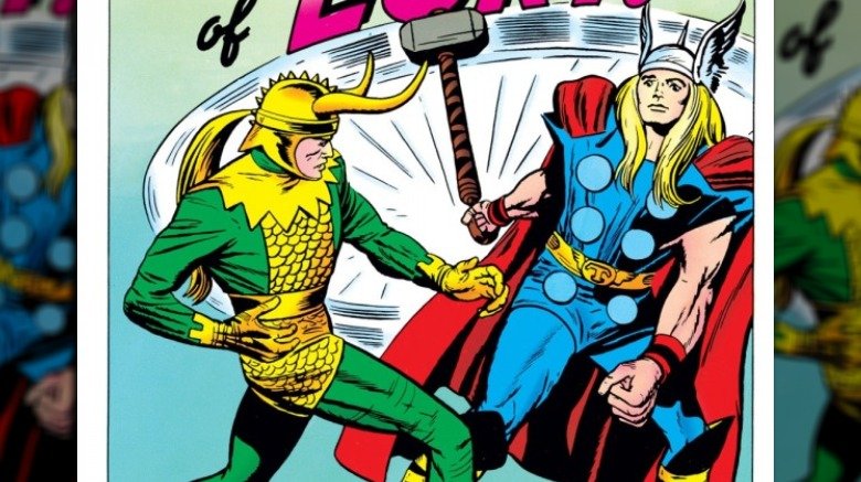
Odin and Loki — Thor's dad and adopted brother, respectively — were first drawn in Marvel Comics by the legendary Jack Kirby, who probably didn't rely on many — or any — actual mythological details to bring them to the page. Both debuted shortly after Thor's own first comic book appearance in Journey into Mystery #83 in 1962. But even though they both showed up right around the same time in the funnybooks, their looks couldn't have been more different in terms of design and even simple consistency.
Loki's costume from Journey into Mystery #85 may not be a pretty sight, but it is an excellent example of how to design a bad guy. Where Thor wears blue, red, and has graceful looking wings on his helmet, Loki is a perfect contrast to those details. His outfit is green and yellow, and instead of a headpiece with wings that angle backward, his own outfit features aggressive horns that jut outward. While Loki's look has evolved over the years, these have been constant features that appear in nearly every incarnation. Odin, on the other hand, couldn't be less consistent or defined.
Allfather, no style
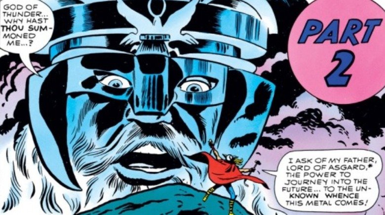
Odin's first appearance only reveals his head, as it appears in the clouds over Thor, Mufasa style. He's wearing a helmet and mask of some kind, but he could probably be best described as "comic book viking mush." His next batch of appearances are no clearer, with various designs that include various assortments of helmets, capes, more helmets, furs, and what sure seems to be a cummerbund with a lightning bolt hastily drawn on it. Considering how important and powerful Odin is supposed to be, he might want to try not getting dressed in the dark.
The Allfather's look continued to evolve each time he appeared, making it seem like artists relished the opportunity to use him for experiments with new space-viking designs. Even when writer-artist Walt Simonson took control of steering the Asgardian royal family's adventures with Thor #337, Odin never stayed in one outfit for long, sometimes even making costume changes within the very same issue. Simonson's run is famous for introducing Beta Ray Bill, Frog Thor, and that incredible scene when Skurge machine-guns a bunch of demons, but his Odin remains as impossible to pin down as anyone else's.
"Loony Loki"
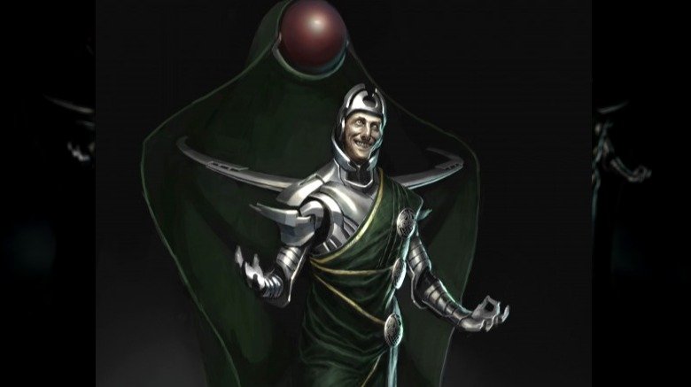
When Charlie Wen became the head of visual development at Marvel Studios, one of his first tasks was adapting the mythical land of Asgard and its powerful inhabitants for the first Thor movie, which arrived in 2011. And that meant trying to define the looks for Thor's immediate family members. But before he could settle on a specific direction, Wen first had to find directions he wanted to avoid. Hence the version of Loki above, which Wen calls "Loony Loki."
While Loony Loki retains the classic green and gold colors from the comics, nearly every other element seems transformed. Wen explained:
"Loki's horns are — it's really represented in this floating shape that's behind him that also changes. And it'll float back up into shapes that you'll recognize as being his horns. [...] it was more like, how do we still capture that character but in sort of unique ways?"
Bending to the breaking point
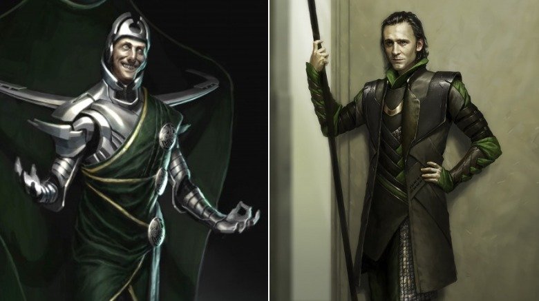
This version of the character was never really meant to show up on film — in fact, this design came about before there was a finished script, and before director Kenneth Branagh came onto the project to direct. Rather, Wen was experimenting, seeing how far out of shape Loki could be bent before he became unrecognizable.
"I was trying to push it as far as I could," Wen said. "I understood the icon, but [thought,] let me try to rip it as far apart from that while still trying to maintain who that is. And it probably broke at some point, but [...] that's actually what you're trying to do, is understand how far do you go until it actually breaks."
"When I show that to people who are big Loki fans, there's just terror — everyone's like, 'I'm so glad that it wasn't like that,'" Wen added.
That chair does not look comfortable
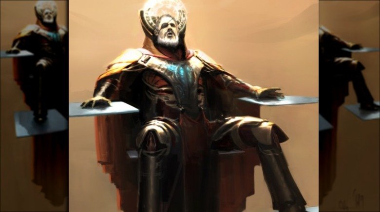
Loki wasn't the only character to get stretched. Again, Odin's never really had much in the way of a consistent comics look, so there's not much Wen could've done in his early designs that would've been out of bounds. It's fascinating to imagine the Asgard Wen was building early on, since it seems like it would've gone more into Thor's sci-fi elements than the Shakespearean super-fantasy we got instead. Odin and his outfit and furniture in this concept image speak to the movie that could have been.
"The thing that we were trying to get at was that the MCU is filled with magic, but that magic is really science that we don't understand [...]. Thor's is this magical world, this realm that we didn't understand but we wanted it to still be based in science."
As to Odin's chair itself — floating platforms that seem to have appeared in the first Guardians of the Galaxy movie for Thanos' throne — Wen explained this design was part of an earlier idea for how magic and science would come together in Asgard. The Rainbow Bridge, for instance, would form as floating platforms that would appear as a person crossed it. When Asgard's design shifted to the more fantasy-based style that we saw in the Thor movies, Odin's floaty throne went away. Which, according to Wen, was probably helpful for at least one actor.
"Thank goodness for Anthony Hopkins that he didn't have to sit on anything like that," he laughed.
You can follow Charlie Wen on Instagram, Twitter, and Facebook.