Movie Posters That Blew Up In The Studios' Faces
Designing movie posters isn't the easiest job. It's one thing to convey the essence of the characters and the spirit of the film in a two- or three-minute trailer, but it's quite another to communicate to your potential audience why your movie is a must-see deserving of their hard-earned dollars with a single image. The best posters accomplish this not with a sea of floating heads or a busy, action-packed mess, but with artistic renderings designed to catch the eye and ignite the imagination. Think of the classic posters for Jaws or Tim Burton's original Batman: striking, bold, and brilliant in their simplicity.
But as with all things film-related, the quest to understand and captivate your audience with an incredible poster design can backfire spectacularly. The posters we'll be looking at here certainly struck a chord, and got people talking — just not in the ways their designers intended. Most went too far with violent or sexual imagery, and some were simply ill-timed, but they all generated plenty of publicity for all the wrong reasons.
Note: Links to the posters in question are provided, and many of them are NSFW.
Saw II
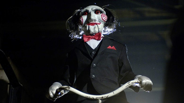
When 2004's Saw became a surprise smash hit, it took studio Lionsgate about ten seconds to greenlight a sequel. Fans of the original knew what to expect: more sadistic puzzles, more nefarious devices designed to maim and kill, and lots, lots more blood and gore. The poster for the second installment could easily have raised these expectations simply by displaying the film's title — which, in a manner of speaking, it did. Following the word "Saw" on the film's first official one-sheet were two grimy, bloody, severed fingers in place of Roman numerals, an aesthetic choice which did not sit well with the MPAA or its Classification and Rating Administration, known as CARA.
Further stoking the organization's ire, some websites immediately began selling prints of the poster, while others posted a trailer for the film which likewise had not been MPAA-approved. Following a stern public rebuke by the organization's advertising director, Lionsgate dutifully (but slowly) began recalling physical one-sheets and contacting websites asking them to remove the offending image; the film's official website even dragged its feet replacing the image with a slightly cleaned-up version. The brouhaha did little to hurt the film's publicity, however — Saw II grossed even more than its predecessor, and posters for future installments continued to push the limits of good taste.
View the original poster.
Zack and Miri Make a Porno
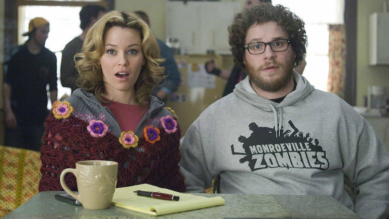
Filmmaker Kevin Smith knew his 2008 rom-com Zack and Miri Make a Porno would ruffle feathers long before it was even released. It's a funny, sweet-natured, and decidedly non-erotic film, but the title happened to contain a word which would raise the righteous indignation of certain types of people regardless of context. "Going in, I knew if you put 'porn' in the title you'll turn some people off," Smith told NPR shortly before the film's release. "But I assumed the people who'd be turned off by that title were never coming to this movie to begin with, so I wasn't losing anything."
Perhaps so, but the movie's first poster — which featured stars Elizabeth Banks and Seth Rogen fully clothed — drew fire for the suggestive placement of their respective heads, without going into explicit detail. The MPAA once again leaped into action to ban the poster, drawing more amusement than anything else from Smith. The action was extra-strange considering the fact that the poster for the 2007 Dane Cook vehicle Good Luck Chuck had featured a very similar image, with its star decidedly non-clothed — yet that poster was approved. Zack and Miri's marketing team subsequently released a new one-sheet sarcastically proclaiming, "Seth Rogen and Elizabeth Banks made a movie so titillating, we can only show you this drawing" — complete with stick figure renderings of the duo.
Silent Night, Deadly Night
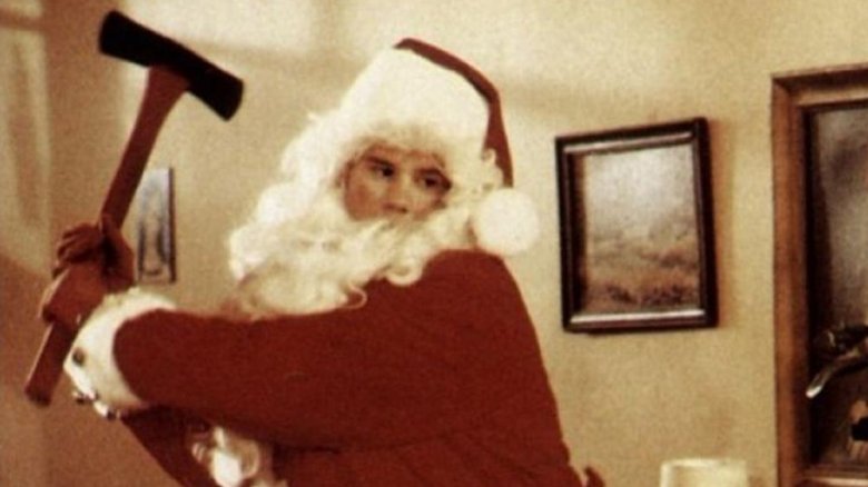
In the early '80s, producer Scott Schneid had a brilliant idea for a concept which could ride the then-current slasher movie wave, based on a simple two-word pitch: "psycho Santa." He tapped screenwriter Michael Hickey to pen what was, in his estimation, an amazing script titled Silent Night, Deadly Night. Schneid would later say that he found the concept to be "potentially incredibly visual and franchisable," and he commissioned designer Burt Kleeger to come up with the poster. "Not for one second during the conception, development, or leading up to the release of the film," said Schneid, "did I think... that there was going to be any kind of backlash against this project." But then, Kleeger's poster — featuring a man dressed as Santa emerging from a chimney, wielding an axe — hit theaters, and all hell broke loose.
Parents across the country were suddenly up in arms over the film's very concept, and its release — on November 9, 1984, the same day as A Nightmare on Elm Street — was greeted by protesters picketing outside theaters where it was being screened. Despite the film performing well at the box office — uptight parents, after all, were not its target demographic — distributor Tri-Star quickly began recalling the posters, then pulled the movie itself from theaters after only a couple of weeks.
The People vs. Larry Flynt
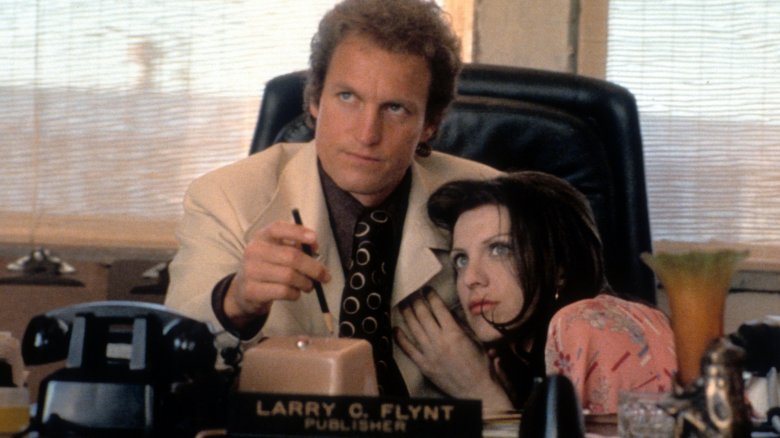
No matter what you think of the subject of Milos Forman's 1996 biopic The People vs. Larry Flynt, you'd be hard-pressed to argue that the man isn't a champion of free speech and a staunch opponent of censorship. Sure, he took up these mantles for reasons that were completely self-serving, but it could be argued (and, with his film, Forman essentially does argue) that this is beside the point. Flynt and his attorney Alan Isaacman (portrayed by Edward Norton in the movie) tirelessly slammed doors shut on those who sought to impose their standards of "decency" on everyone else, and if not for those efforts, the whole of entertainment might look very different today.
A touch ironic, then, that the first poster for a film which is basically about the perils of excessive censorship was... well, censored — but not exactly surprising. The poster seemed designed to provoke, with its depiction of Flynt (Woody Harrelson) clad only in an American flag loincloth, striking a Christ-on-the-cross pose on the super-sized pelvis of a woman in a bikini bottom. The MPAA swatted the poster down, to be replaced by one featuring Flynt with his mouth taped shut by an American flag — a striking image, but one which left the film's star underwhelmed. "I don't think [the new poster] is nearly as colorful or interesting or really says it as well," Harrelson said. Non-U.S. markets agreed — the original poster was still used for overseas promotion.
Teenage Mutant Ninja Turtles (2014)
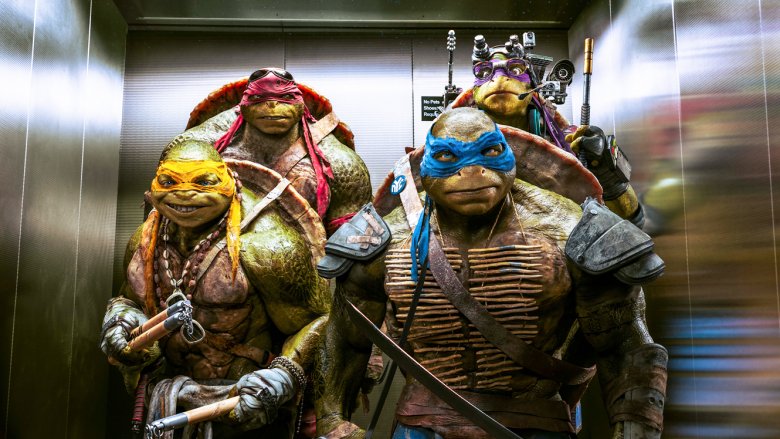
The 2014 live-action adaptation of Teenage Mutant Ninja Turtles was a lot of things — unnecessary, borderline horrifying to look at, not a good movie — but controversial was not one of them. The poster that stirred up an internet brouhaha was not intended for American audiences specifically; it debuted in a tweet from Paramount Pictures Australia, and featured the film's Australian release date. That date: September 11. The image: our four heroes leaping from the top of a tall, exploding skyscraper.
The grim connection between that date and that image seemed to have been lost on the poster's (presumably Australian) designers and Paramount Australia's brass, but it didn't take them long after tweeting out the image to make the connection. A furious backlash quickly followed the tweet, forcing Paramount to apologize profusely for what was doubtless a profoundly boneheaded error. "We are deeply sorry to have used that artwork for the marketing materials promoting the September 11 opening in Australia," the production house said in a statement released to the press. "Combining that image and date was a mistake. We intended no offense and have taken immediate action to discontinue its use."
This Film is Not Yet Rated

The 2006 documentary This Film is Not Yet Rated was going to stoke the ire of the MPAA in any event, because it is about the MPAA — specifically, about how its members are mysterious, the process by which it issues ratings is nebulous, and it seems at once obsessed with "protecting" the public from frank depictions of sex (especially those involving same-sex couples) and wholly unconcerned about explicit scenes of violence. Filmmaker Kirby Dick's enlightening yet frustrating film digs as far into the MPAA's inner workings as it can (which is to say, not very far) and even depicts Dick's own struggles with the organization over the very film he's making, which necessarily includes scenes cut from feature films in order to illustrate its points.
The film's poster was almost certainly designed to play into its entire theme. It depicts the movie's logo being branded onto a woman's naked backside, and promotional materials almost immediately started referring to it as "the poster they wouldn't let you see." One might assume that the "they" in question was the MPAA, but no: after the organization slapped the film with an NC-17 rating, the producers chose to release it unrated, which meant its poster never fell under the MPAA's jurisdiction. The one-sheet was actually "banned" by newspapers and major media outlets, simply because it violated their publishing standards. One could be forgiven for thinking the whole thing was a marketing ploy, because it very well might have been.
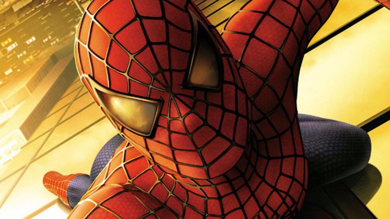
Spider-Man
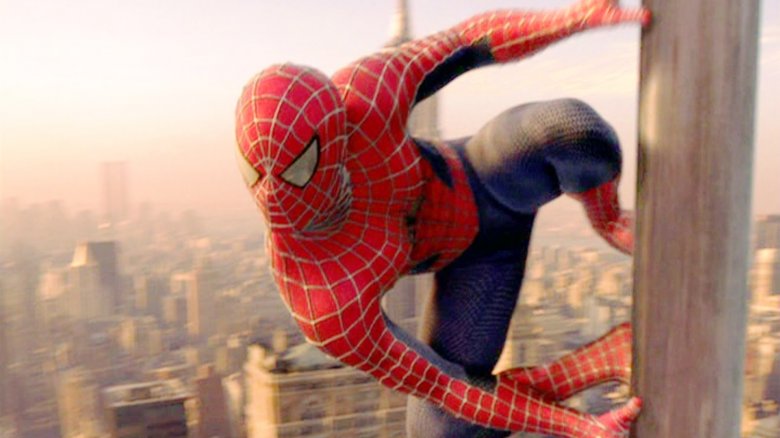
Marketing for Sam Raimi's highly anticipated 2002 film Spider-Man began in the summer of 2001, with an ingenious and novel teaser trailer. It depicted a crack group of criminals staging a daring heist, making their escape by helicopter; nothing about the trailer gave away the film it was advertising until the very end, when the getaway chopper winds up stuck in a massive spider's web... spun between the twin towers of the World Trade Center. The trailer thrilled audiences right up until September 11 of that year, at which point it became a traumatizing reminder of a national tragedy and was promptly pulled from theaters.
The "banned trailer" has become the stuff of legend, but few remember that the film's first teaser poster was hurriedly pulled for pretty much the same reason. The one-sheet featured Spidey's face peering from around the corner of a building at a dizzying height, and reflected in his eye pieces were — you guessed it — the twin towers. Sony Pictures issued a request for the poster to be pulled on September 12, and when the film was released the next summer, New Yorkers were touched to find that it contained a small love letter from Raimi and company. The scene in which citizens pelt the Green Goblin with garbage while shouting, "You mess with one of us, you mess with all of us," was shot after principal photography had wrapped, and was included as a nod to Spidey's resilient hometown.
Return of the Jedi
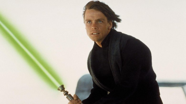
The final chapter in the original Star Wars trilogy, 1983's Return of the Jedi was perhaps the most anticipated film ever at the time of its release. The 1977 original had become a cultural phenomenon like nothing else before it, and 1980's The Empire Strikes Back had left audiences with a grim, downbeat cliffhanger ending, the fate of the Rebel Alliance uncertain. The hype for the third installment began months before its release, with the earliest teaser trailers and posters showing up around Christmas 1982. The poster featured a clean, sharp design, and promised a final duel between Luke Skywalker and Darth Vader — there was only one slight problem.
Up until just a few months before its release, the film had been going by a different title, and Star Wars fans around the world were pumping themselves up for the premiere of Revenge of the Jedi. Apparently, it took George Lucas and everyone involved with the film far too long, months after the promotion machine had kicked into high gear, to realize that the whole idea of revenge goes against everything the Jedi Order stands for, and the title was hastily changed to Return at the eleventh hour. The original title seemed to stick with Lucas for decades, however; he recycled it for the final chapter in his prequel trilogy, 2005's Star Wars Episode III: Revenge of the Sith, because Sith have absolutely no problem with the whole revenge thing.
View the original poster.
Captivity
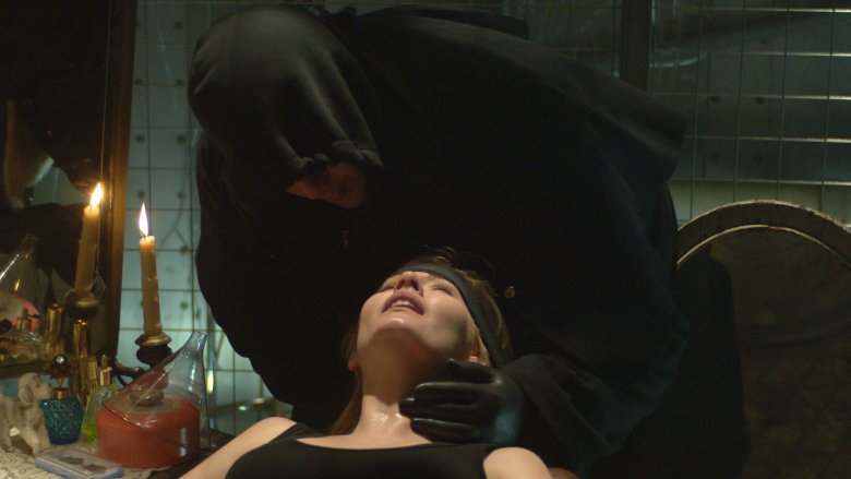
2007's Captivity is arguably the nadir of its decade's fascination with so-called "torture porn," the somewhat disreputable horror subgenre which spawned the cash cow Hostel and Saw franchises. It is, by most accounts, a terrible film, and it's been speculated that it actually hurt the career of star Elisha Cuthbert. Critics found it to be a nasty, brutish piece of work, and to be fair, its promotional art — which appeared briefly on billboards in Los Angeles and on New York taxi tops — let audiences know exactly what they were in for. It featured four panels — titled "Abduction," "Confinement," "Torture," and "Termination" — depicting Cuthbert in just the states described.
Passersby were understandably disturbed that such graphic images would be splashed across giant billboards and ferried around atop cabs for everyone (including children) to see. The producers claimed, incredibly, that the billboards went up totally by mistake — that the printer was sent the wrong image files, which were incorporated into the artwork and passed along to the billboard company with no oversight from the filmmakers. This does not exactly seem plausible, but if it was a publicity stunt, it wasn't a very good one. The mixup reportedly cost distributor After Dark Entertainment a half million dollars, and the film utterly bombed; it's even been pointed to by some observers as the dud that put the final nail in the coffin of torture porn in general.
Friday the 13th Part VIII: Jason Takes Manhattan
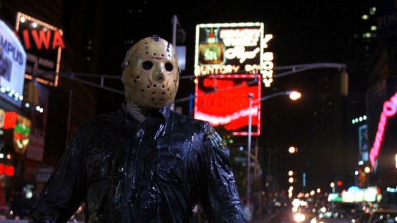
By the time Friday the 13th Part VIII: Jason Takes Manhattan hit theaters in 1989, the series had become far more well-known for winking at its audience than for brutal violence. Beginning with Friday the 13th Part VI: Jason Lives in 1986, the franchise took on a distinctly comedic tone, and many of Part VIII's kills played more like slapstick than horror. The original poster for the film nevertheless ruffled feathers, but not those of the general viewing audience. It was the New York Tourism Board which took issue, as the one-sheet featured Jason Voorhees slicing through the iconic "I heart NY" logo — which is a registered trademark of the Tourism Board.
Clever though the campaign might have been, studio Paramount was forced to replace the one-sheet with an alternate image of Jason's hockey-masked visage looming over the New York skyline. A contemporary clipping from the New York Daily News, dripping with contempt for "Hollywood types," pointed out snarkily that the Tourism Board's "victory" over Paramount may have been a bit hollow. Said the article's author, "They couldn't have paid for this type of publicity... any New Yorker who gets suckered by Hollywood slickers should be assigned to do a smartness course." If you ask us, that's giving Hollywood slickers just a bit too much credit.