The Hidden Meaning Behind These Movie Posters
While some posters are designed just to look flashy or show off how many A-list actors the graphic design team could cram into a 24" X 41" sheet of paper, there are those rare few that aspire to do something more.
Perhaps they want to tell a story in and of themselves, detached from the movie they're promoting. Maybe they have a real message to communicate through their art, one that might seriously impact how you view the world around you. They could even be satirical political statements that push the envelope so far that they almost prompt an angry totalitarian regime's leader to declare war.
Any number of things are possible when poster artists dig a little deeper and try to plant some hidden meaning into their advertisements for movies—such as with the following incredible posters, all of which are crammed full of subtext and hidden references that you've probably never noticed.
The Interview's poster mocks North Korean propaganda
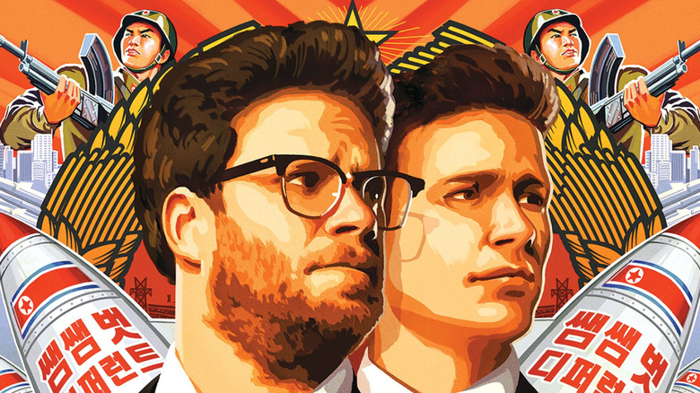
Remember that one Seth Rogen comedy that almost spurred a nuclear war between North Korea and the United States? Its notoriety was not in any way, shape or form helped by the creation of controversial posters such as this one. Provocatively kooky and fun on the surface, it's also a decidedly pointed jab at North Korean propaganda culture as a whole. This thing is low-key taking a direct stab at an entire political regime, and it's just a movie poster. What part might've annoyed Kim Jong-Un the most, you ask? Was it the mocking usage of "capitalist pigs" or the "we will start a war" threats plastered in Korean onto the artistically depicted North Korean nuclear warheads?
When it comes to finding out whether Kim still holds a grudge against us, well, we may find out soon enough. But if North Korea does finally attempt something, remember to look in the rear-view mirror and blame Seth Rogen for starting the whole kerfuffle in the first place.
As Above So Below's poster exposes where Hell really is
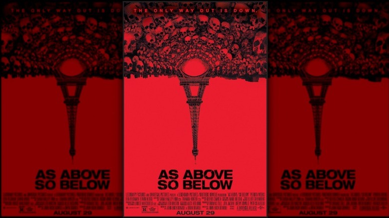
This poster sports a very interesting bit of metatext that seems unlikely to be caught by the untrained eye. Riffing off its title, the poster for As Above So Below depicts an upside down Eiffel Tower that's pointed decidedly in the direction of Hell. But what if, in fact, it's not pointing towards Hell—but is actually representing Hell itself? What if the Eiffel Tower is actually mirrored to represent that we're all in Hell right now? It makes sense, after all. What other place could we be where people build tunnels out of their fellow man's skulls, where human agony and suffering are utilized as building blocks for urban planning? If this is not Hell, the poster says, nothing is. The earth humanity has inherited and continually bastardizes has become our own worst nightmare and punishment, though we fail to see it.
It's heavy stuff, guys.
Fury's poster comments on the nature of war
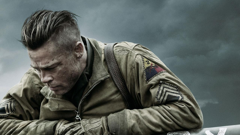
War movie posters usually aren't that tricky to make. Include a soldier looking intense or fatigued, throw in a tank or a bomber, and bam—the movie's already sold itself. But what happens when a war movie poster attempts to genuinely articulate the horrors of its subject matter while simultaneously shame its entertainment-embellished peers? Fury, that's what.
This subversive piece of art holds a special place in the annals of poster history, as it contains not one, but two rarities: a defeated-looking Brad Pitt and a tank that's so depressingly humanized it almost looks opposed to the idea of doing its job. This is a poster that quietly whispers in your ear just how awful you are for wanting to go see a movie that glorifies war, one that mocks you for being a blood-thirsty savage. It's deceptively provocative stuff that perfectly advertises the movie it's representing.
Logan's poster doesn't want to be a superhero movie ad
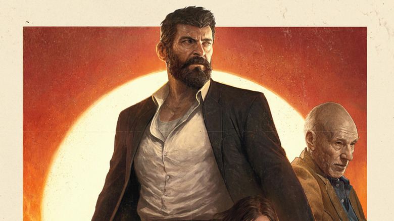
If there's one thing Logan doesn't (but secretly does) want you to know, it's that it's not your average superhero movie. It hides this behind a (totally not) subtle Western-themed poster that references an era of slow-burn, morally weighted movies that have long since passed. This is a story just as much about superhuman powers as it is the gritty reality these poor characters are forced to slog through, which truthfully does make the movie more akin to its poster's genre archetype than a superhero adventure. It's a poster that's a bit on the nose with its message, but hides the true extent of its meaning until after you've walked out of the theater.
The Social Network's poster breaks down Mark Zuckerberg
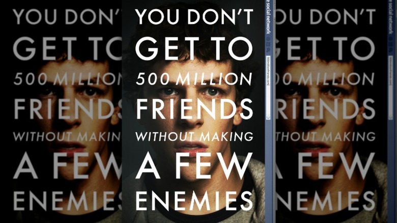
The Social Network's poster manages to sum up everything about Mark Zuckerberg in a single, text-laden image. Whether or not you recognize it, this poster is an entire Wikipedia article on the Facebook founder compressed into just a few neat details.
"You don't get to 500 million friends without making a few enemies," the poster reads. It tells us that, as is the case with most game-changers in our society, the toxic naysayers and general opposition who stand in their way are always the most intimately remembered while the hundreds, thousands, even millions that celebrate their accomplishments are distant and impersonal by comparison. It paints a sad, lonely picture when portraying Zuckerberg's struggles for success and outlook on people, a tone the movie heavily reinforces. Similarly, Jesse Eisenberg's socially awkward, anxiety-ridden and ambiguously peeved face further helps to cement the above sentiment—that the guy's a loner in a world he perceives to be perpetually embittered against him.
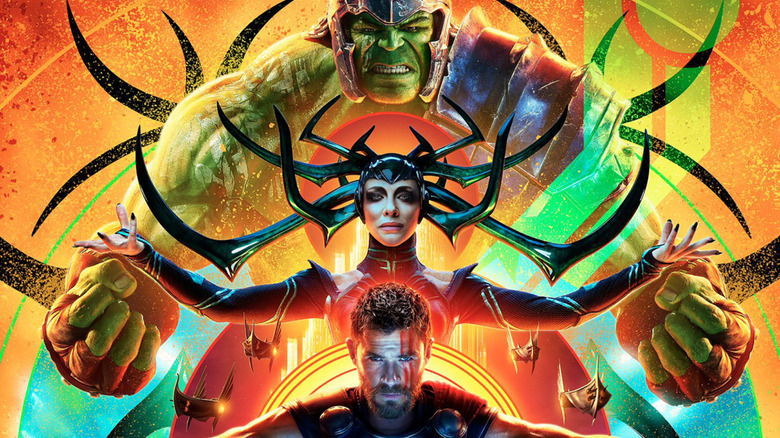
Thor Ragnarok's poster references the nine realms
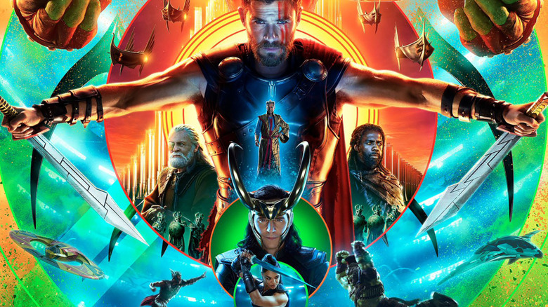
Thor: Ragnarok is the proud owner of one of the most awesomely designed posters in MCU history. Featuring colors galore, a dope retro aesthetic and some very cool renders of all the lead characters, you might be wondering: how can this thing get any better?
The answer is simple: a hidden reference to historic Norse mythology, also known as the entire basis for Thor's movies. Those big, colorful rings surrounding the characters? Those are a direct nod to the nine realms and the tree of life, the latter of which in this case is represented by Thor himself. And in a way, the message the poster is trying to convey is true, in that Thor is the central component in this entire universe's activities. In any event, it's a very cool way to get some old-school symbolism and imagery across while still rocking to the beat of 2017's drums.
Kong: Skull Island's poster is an ode to Vietnam
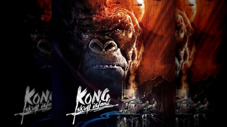
If you thought making King Kong look as intimidating and cool as possible was this poster's only merit, think again. The design of this one is particularly old-school, hearkening back not only to the days of the Vietnam War, but also to the movies centered around it. Specifically, Skull Island's poster is riffing off Apocalypse Now, a Vietnam-focused Francis Ford Coppola movie that featured an extremely similar aesthetic for its promotional art. From the stylized title font to the helicopters ripping across a blood-red sunset, Kong is going one-for-one with its source of inspiration when it comes to throwback accuracy.
A Cure For Wellness's poster is a poisonous oxymoron
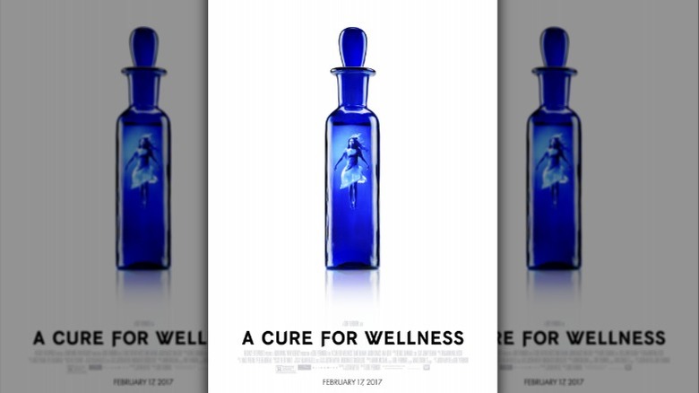
A Cure For Wellness's poster is a really, really cool one. If the title alone sends chills down your spine, the poster only serves to reinforce that fear. Anyone who searches for something too good will invariably end up finding something bad, the poster warns, as can be found in the metaphorical "cure" it depicts that's actually modeled after a Victorian-era poison vial. This is representative of the unintentional evil that festers in the quest for inhuman perfection and the movie's general theme that no matter how noble the goal, trying something villainous in the name of progress will always result in a sin to die for.
Saving Mr. Banks' poster reveals the creators behind the characters
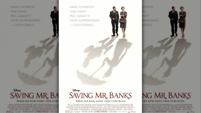
This poster sells a subtle but powerful idea: two humans, Walt Disney and P.L. Travers, were never able to escape the shadows of their own work. When people think of Disney, both the man and the company, they think of Mickey Mouse—and if you know P.L. Travers by name, it's almost definitely in connection with her most famous creation, Mary Poppins. This poster serves to advertise a narrative about the people responsible for these icons; a movie about the man behind the mouse and the lady who really held the magical umbrella. It's nuanced, elegant advertising at its finest.
The Silence of the Lambs' poster tells a story of psychological agony
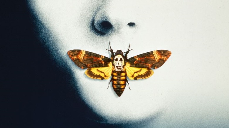
The Silence of the Lambs' poster isn't ultra-iconic by accident. This painstakingly designed, expert piece of subliminal messaging was crafted from the ground up to telegraph just how ominous the movie was. Why is Clarice's skin so pale? To ready audiences for the abundance of death ahead. What's the deal with that creepy death's-head hawkmoth covering her mouth? It's symbolic of the transformation Clarice must go through to conquer her foes, similar to the moth in the movie itself, which transforms within a cocoon that's been stuffed inside the mouth of one of Buffalo Bill's victims. And that same freaky moth covering her mouth alludes to—you guessed it—the titular silence of the lamb, a.k.a Clarice herself.