Why The First Twilight Looks So Different From The Rest Of The Series
For fans of the well-known "Twilight" films, released from 2008 to 2012, it can be hard to keep track of everything that happens in the series. With five films in total, "The Twilight Saga" tells the story of Bella Swan, played by Kristen Stewart, a normal teenage girl living in Forks, Washington, who falls in love with a boy named Edward Cullen, played by Robert Pattinson, who just so happens to be a vampire.
From "Twilight" to "Breaking Dawn," fans follow the couple's romance through plenty of ups and downs, ending with a marriage, a baby, and a turning. The series also stars Taylor Lautner as the werewolf Jacob, Billy Burke and Sarah Clarke as Bella's parents, and Nikki Reed, Kellan Lutz, Ashley Greene, and Jackson Rathbone as Edward's siblings, among other familiar names.
Over a decade later, many behind the scenes stories about the making of the popular franchise have come out, such as the many different actors who almost got the iconic roles, and why Rachel Lefevre got replaced, but fans might've missed the major detail that sets the first film, "Twilight," apart from the rest of the series, along with why this particular decision was made.
Catherine Hardwicke added the blue filter and cool tones to Twilight
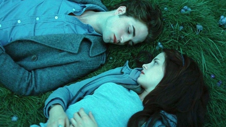
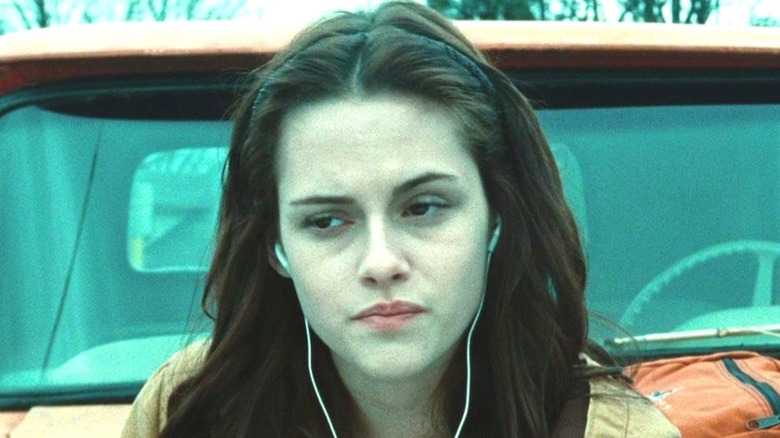
As the only film in the franchise directed by a woman, "Twilight" has Catherine Hardwicke at the helm, whose previous work includes "Thirteen" and "Lords of Dogtown." A few different directors came on to direct the subsequent films, but Hardwicke brought a distinct style to the franchise with her choices in "Twilight." The main feature that allows the first film to stand out from the rest is the blue filter that is present throughout the whole movie, painting the story in blues and grays and other cool colors. The reason for this choice was to create the dreary feeling of Forks — the rainy home of a family of vampires in hiding — as well as emphasize the paleness of the Cullens and the cold exterior they put on for Bella when they first meet.
Considering that Hardwicke was forced to cut $4 million from the movie's budget just a few days before shooting, she definitely made do with what she was given (via Vanity Fair). The same cool-toned coloring style is present in her previous film "Thirteen" as well, making it a signature for the director. Speaking with the Daily Beast 10 years after "Twilight" premiered, Hardwicke discussed how the movie wasn't expected to be successful in any way. She was originally given the job because of this fact, so once the franchise got popular and started making money, Hardwicke was left behind and replaced with white male directors moving forward, which was why she didn't direct any more "Twilight" films.
Fans can't handle what Twilight looks like without the filter
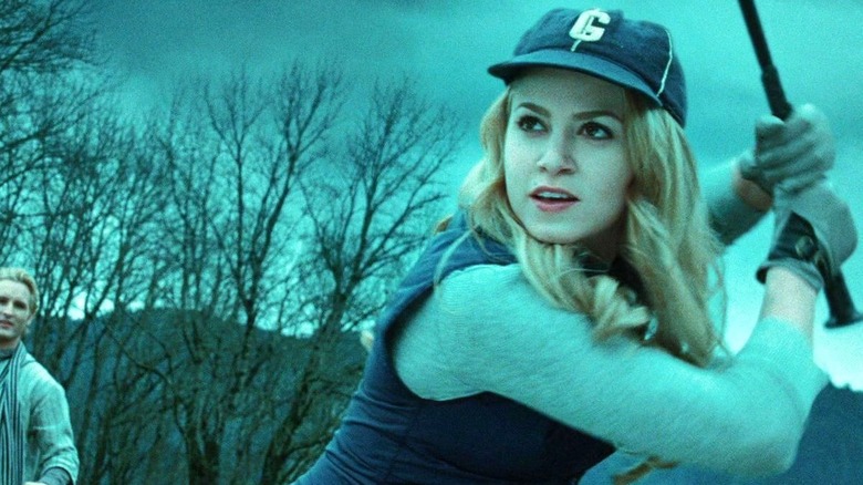
While there are obviously fans of "New Moon" and the later films, it's safe to say that they are missing the unique style that Hardwicke brought to "Twilight" with the blue tones. Many longtime fans of the series have noticed this detail, and even considered what "Twilight" would look like without it. Here's a hint — it's weird.
Earlier this year, a user on Twitter, @twilightreborn, posted a behind the scenes picture of the famous baseball scene from the first movie without the blue filter. The caption on the post reads "'Twilight' without the blue tint just makes me uncomfortable," followed by another post declaring, "let's all thank Catherine Hardwicke for her vision, 'Twilight' looks so much better with the blue tint." Clearly, plenty of people agree, as the post currently stands at 337,000 likes and 46,000 retweets.
Now 12 years after the fact, "Twilight" fans are finally giving Hardwicke the credit she deserves for directing such an iconic and unique movie that sparked a worldwide vampire phenomenon. Let's be honest, what would "Twilight" be if it didn't have the blue filter?