What The Guardians Of The Galaxy Almost Looked Like
It takes a lot more than accurately re-creating a comic book character's outfit on the big screen to make a superhero movie worth seeing. And anyone who's seen the terrible film version of Captain America from the '90s knows it. In terms of comic book costume accuracy, it's a ten out of ten! For having literally everything else be absolutely terrible, it's a negative twelve-and-a-half.
Needless to say, when former Marvel Studios head of visual development Charlie Wen sat down to adapt the classic Marvel Comics cosmic super team the Guardians of the Galaxy, he had a lot more on his mind than comic book accuracy. To get the right look for the right character, Wen and his team tried beginning with the right words before anything else, which informed the design process.
"Oftentimes if I'm designing, or if I'm working with other designers that are in my department at the time, it's starting with those descriptors," he said in our exclusive interview. "What do those descriptors remind you of? And so there's just a lot of adjectives, actions, verbs, anything that define who those characters are, that I wanna make sure that we always go back to."
So what process did Wen take with these relatively obscure Marvel D-listers to bring them into the mainstream? Here's what the Guardians of the Galaxy almost looked like.
2014: A Marvel Space Odyssey
Because the Guardians of the Galaxy were relatively unknown characters before the movie broke out big in 2014, Wen had a lot of freedom to explore different designs for the film's characters and settings. Part of that freedom, said Wen, came from the fact that Marvel Studios chief Kevin Feige was "a true Star Wars fan." That, and the fact that the Guardians themselves were pretty obscure in the public consciousness, meant that Wen was free to create Marvel's very own Star Wars.
"This one also had a special place in my heart," said Wen of designing the visuals for Guardians of the Galaxy. "Iron Man, Thor, Captain America, Hulk — all these characters are pretty defined. People know what they are."
Wen continued: "Guardians — nobody knew what Guardians was. It's very niche [...]. But what it did do is it allowed for a lot of exploration to create a Marvel Space Odyssey."
Wen's process for designing the looks of even just a couple of characters would take whole articles of their very own to document — so we did just that for Gamora and Drax. But the story doesn't end with those two... they were just the tip of the iceberg.
Rocket, man
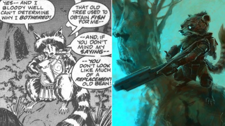
In 1976, writer Bill Mantlo wrote a spacefaring comic book story called "The Sword in the Star," introducing a new character drawn by Keith Giffen: Rocky — not Rocket — Raccoon. Armed with a gun, a cigar, and a bunch of attitude, Rocky came back six years later with a new design as Rocket Raccoon when Mantlo was writing The Incredible Hulk. The character would come back again and again over the years, never really straying from the core characteristics Mantlo had given him at the start. These attributes played a huge role in Wen's design work for Rocket.
"He's impatient," said Wen of the important details he wanted to capture when designing Rocket. "He's got the little guy syndrome, the Napoleon syndrome. Definitely a big man in a little body [...] bursting out at the seams. He's always up to eleven."
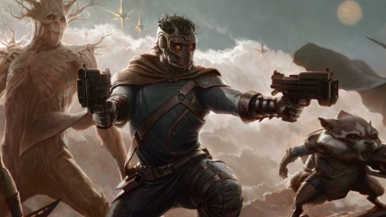
When you look at the concept art Wen created during Guardians of the Galaxy's pre-production, Rocket's huge personality comes through clearly. Even the way he's standing — battle-ready, with a snarl on his face — is perfectly contrasted with Groot's presence in the background. And while we're on the subject of Groot...
All bark, no bite
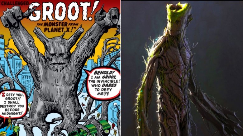
Unlike Rocket, Groot evolved significantly from his comics debut. In 1960, on the cover of Tales to Astonish #13, a giant tree monster named "Groot from Planet X" shows up on a busy city street on Earth, daring someone to fight him. He returned as a monster 11 years later to fight the Hulk, and finally started resembling our peaceful, heroic Groot when he appeared in 2006's Nick Fury's Howling Commandos and 2007's Annihilation Conquest. In the latter series, he seemed to develop the friendship with Rocket Raccoon that became so central to the 2014 film.
In fact, according to Wen, Groot and Rocket were two of the biggest question marks going into the film's pre-production period.
"Nobody knew if this was gonna work, and everybody was very nervous about Groot and Rocket, because the whole movie was contingent upon those two characters, a tree and a raccoon, being an integral part of that five-character team," recalled Wen.
Meanwhile, Wen contrasted the moss-topped Groot above with Rocket's fiery personality. When asked about the words he'd use to describe the ideas he was trying to get across with his early designs, Wen said, "The background tree, when he needs to be — but he's a nice, quiet, empathetic, sympathetic addition to that group... the quiet stream that keeps a peace between all of them."
The importance of a Walkman
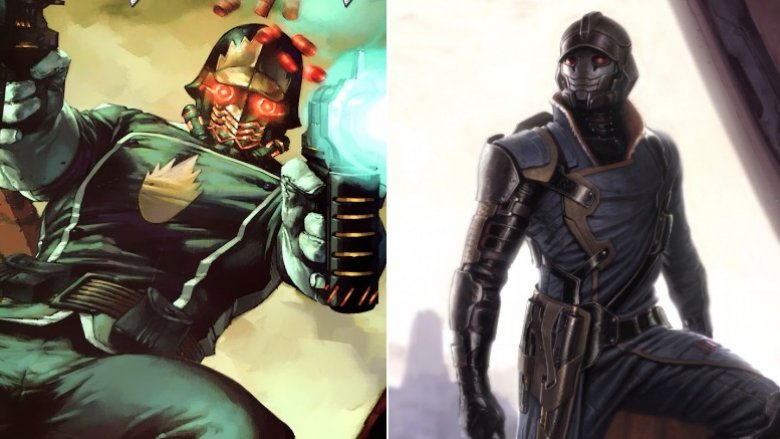
Star-Lord has had plenty of looks over the years, though many have retained one constant. From his first appearance way back in 1976 and up through his more modern adventures in Marvel's Guardians of the Galaxy team in 2007, Star-Lord has had a propensity to wear some pretty weird headgear.
Wen tried to capture this element in his concept art, seen in the image on the right. But the design presented some headaches. Wen said the look was "very German World War II military, the shape of the helmet."
He added: "We can't go for something that's going to hearken back to World War II Nazi uniforms. It works with Hydra, for Captain America, Hydra, Red Skull, that makes sense, and they're villains."
The design work took a positive turn once writer-director James Gunn came on board.
"He knew really the tone and feel he wanted," recalled Wen. "James was much more specific with saying, 'Peter Quill's gonna have a tape deck that's important to him.' [...] 'Great, that makes our job so much easier already.' Because that is a visual cue."
That's what led to the cinematic look — the facemask and exposed hair. But the design communicated more about the character than you might have realized.
"Some people were thinking, 'How much does that actually do to the character? You're only showing the hair,'" said Wen. "Well, but hair actually shows character. If it's unkempt and all over, you already see a part of that character."
Super-Nova?
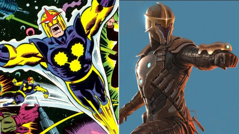
Nova was another important character from Marvel Comics' batch of cosmic stories in the 1970s, though the version we got in Guardians of the Galaxy didn't quite resemble the Earth-based superhero — Rich Ryder — who went by that name.
"At that point in time," recalled Wen of the pre-production phase, "we didn't have the superhero Nova, as opposed to the Nova Corps."
But just because Nova as a lone superhero wasn't written into the script at the time didn't mean that he wouldn't make an appearance in some fashion. As part of his explorations of Marvel's characters and designs, Wen created some Nova concept art that was inspired by Ryder's superheroic alter ego to make sure the filmmakers had as many options as possible.
"I was playing on that line, just in case," said Wen. "So I did some takes where it's more heroic, it stands out more, right?"
Nova as a Marvel Comics character doesn't offer much beyond generally being a pale imitation of Green Lantern — seriously, he's a member of the space police, chosen by a predecessor who was dying in his spaceship. But even still, the visual design of Nova is pretty striking. It's difficult not to be disappointed that Wen's concept art for Nova didn't quite make it into the film in its more superheroic form.
"We did a ton of Nova helmets, some of them really just fantastic helmets from the team, that I wish would have gotten some screen time," said Wen.
You can follow Charlie Wen on Instagram, Twitter, and Facebook.