Hidden Meanings Behind These Superhero Costumes
Good stories, cool powers, and a fresh new hook are all well and good, but there's nothing more important for a superhero's first impression than a great look. A good costume can catch a reader's eye and bring them in for all the other stuff, and a bad one can get an otherwise fine character dropped into the quarter bin faster than you can say "Superman's mid-'90s mullet."
With so much riding on the way a character looks, it isn't as simple as picking out a set of colors and deciding whether someone should wear a cape, so it's no surprise that a lot of thought gets put into those costumes. The results are often packed with layers of meaning and explanations that readers may never notice. But once you see the hidden meanings behind these superhero costumes, you'll never look at them the same way again!
The secret of Superman's trunks
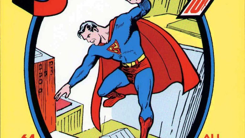
Superman's costume defined the visual idea of a superhero so well that we still think of capes as the signature look of the genre 50 years after Spider-Man, the Fantastic Four, and a host of other popular heroes abandoned them for sleeker suits. But as iconic as Superman's costume is, it also has one of the most debated and dunked-on articles of clothing in the history of the medium: the trunks.
Jokes about Superman wearing his underwear on the outside have been cracked for decades, and DC even tried to get rid of the trunks with a series of costume redesigns in the comics and the movies. That said, they've been a part of his definitive look in thousands of stories, and you can still see them on lunchboxes and t-shirts that sport a "classic" Superman. There have even been attempts to justify them in the comics, like a scene in All Star Superman where Jimmy Olsen mentions that belted "overpants" were the height of fashion on Krypton.
The truth, however, is a lot closer to Earth. As the first superhero, Superman didn't have a template to draw from, so Jerry Siegel and Joe Shuster looked to other sources for inspiration, and given Clark Kent's amazing feats of strength, it's not surprising that they found their answers in the circus. The Man of Steel's look is a direct descendant of costumes worn by acrobats and strongmen, from the cape to the trunks worn over a form-fitting suit. The reasons are pretty obvious—when you're soaring through the air, the last place you want a visible rip in your costume is, well, right where you wear the trunks.
You can even see a similar style on another group of over-the-top heroes and villains that have their roots in circuses and carnivals: pro wrestlers often wear trunks over tights for the same reasons.
Captain America: the modern-day knight
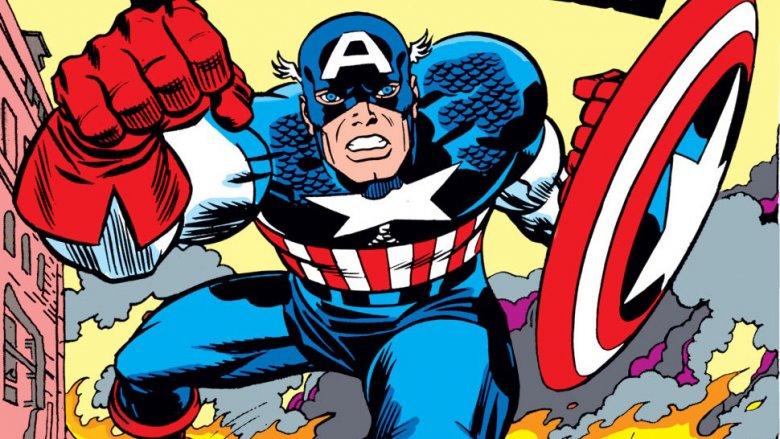
Steve Rogers has been a super-soldier since he first appeared in 1940, but it's only recently that he's actually started dressing like one. The military style touches to his costume, including combat boots and a bulkier belt for supplies, are all touches that have been added over the past few years. The original design drew its inspiration from a different sort of soldier: Captain America was meant to be a modern-day knight.
While they were rarely drawn to be as bulky as their real-world counterparts, those little scales around the star on Cap's chest weren't just there for decoration. They're meant to be seen as scale mail, a type of armor once favored by mounted cavalry that's usually only seen these days in the pages of a Dungeons & Dragons manual. The same goes for his boots and gloves, all throwbacks to soldiers from the past. And, of course, there's the big one: the shield. While Cap's mostly seen with a round shield — better suited for bouncing off of Nazi skulls—the original had the classic shape based on the Presidential Seal, and the look of a knight in shining red, white, and blue armor follows pretty logically from that.
It's worth noting that while Cap is the most successful example by far, the idea of a modern take on the soldiers of the past was one that Jack Kirby, who co-created Captain America with writer Joe Simon, would return to throughout his career. DC's Guardian is built around the same idea right down to the shield, which in his case is an oversized police badge, and OMAC is Kirby's take on a post-apocalyptic Roman centurion.
Wonder Woman's misplaced patriotism
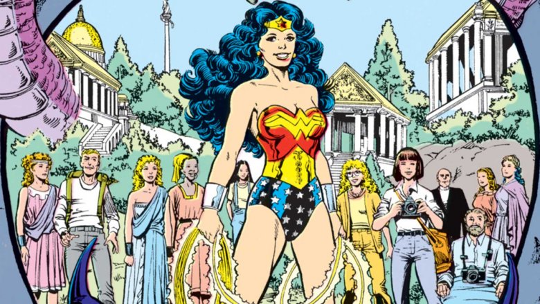
When Wonder Woman debuted in 1941, there was no shortage of characters in comics sporting patriotic costumes, and that makes a lot of sense. There was, after all, a World War raging in Europe that the United States would be involved in by the end of the year, and with characters like Captain America and the Shield leading the way, superheroes wrapping themselves up in the stars and stripes was a trend audiences were more than willing to get behind.
It does, however, raise the question of just why Princess Diana of Themyscira, who is definitely not American and whose closest relationship with the world outside of Paradise Island would be to ancient Greece, would choose that theme for her costume. There have been a variety of explanations over the years, including the Amazons basing their ambassador's costume on the insignias found on a crashed airplane, or that the entire thing is just a coincidence. America does not, after all, have sole ownership on the concept of stars and the color blue.
The bracelets that complete Wonder Woman's trademark look have their own justifications. In the comics, they're explained as being composed of a mystical, bullet-deflecting metal called Amazonium, worn as a memorial of their time spent in slavery. There's a real life explanation, though: Wonder Woman's creators, William Moulton Marston and H.G. Peter, based them on the bracelets favored by Olive Byrne, the third member of Marston's polyamorous triad.
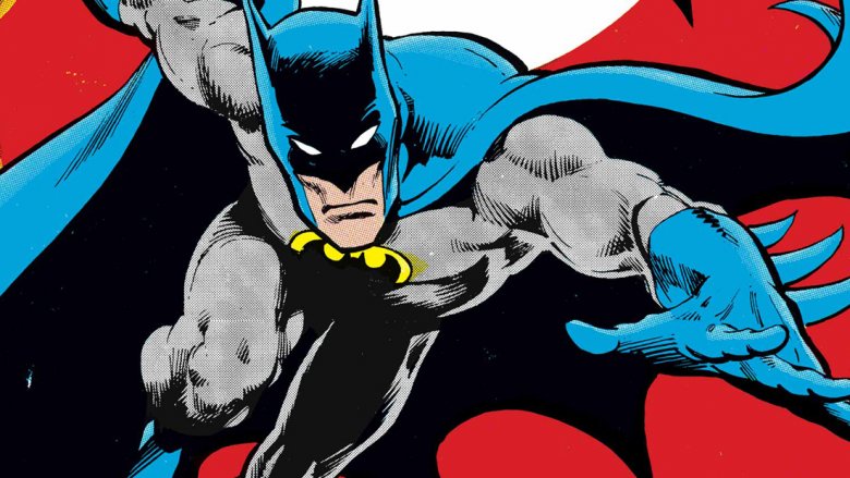
How Batman got his cape and cowl
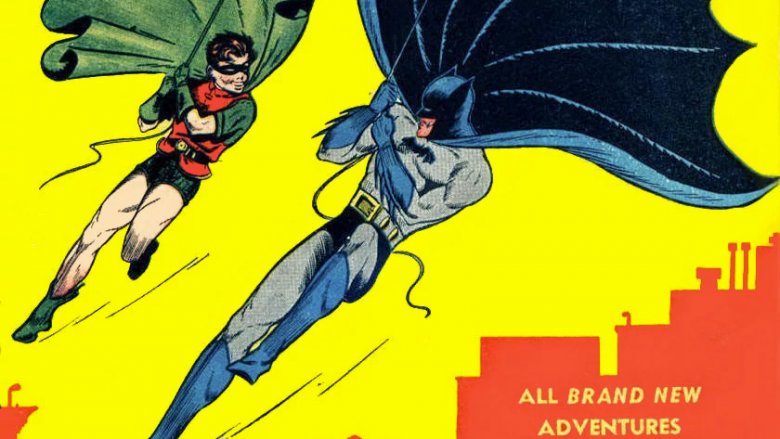
Looking back, it's hard to imagine Batman without the signature look of his costume. Sure, there have been a few changes and redesigns over the years, including the yellow oval famously added to his chest in 1964, but the pointy ears, the cowl covering his face, and the dark blue/black color scheme have stuck around since the Dark Knight took his first steps into Gotham City in Detective Comics #27.
Before that first appearance, however, Batman almost featured a look so drastically different that it's just as hard to imagine him succeeding. In artist Bob Kane's original sketches, drawn after Superman made the scene and sparked a massive wave of new superheroes, Batman was pretty unrecognizable. He had the cape that mimicked bat wings, but was otherwise sporting a bright red outfit, a domino mask, and a head of blonde hair.
It was writer Bill Finger, Batman's often uncredited co-creator, who suggested the darker colors, gloves, and the cowl that would mask Bruce Wayne's identity—along with most of the other things readers associate with Batman. Calling his hometown "Gotham City," characters like the Joker, Catwoman, Robin, and Commissioner Gordon, the arsenal of utility belt gadgets, and even the name "Bruce Wayne" all came from Finger. Sadly, Kane refused to acknowledge Finger's contributions until well after his death, going as far as to call Finger's claims "hogwash" and producing an extremely dubious sketch that he claimed he created as a teen, well before Superman had pioneered the genre. The good news, though, is that starting in 2016, Finger's name was officially added to credits as Batman's co-creator.
The Hulk: gray vs. green
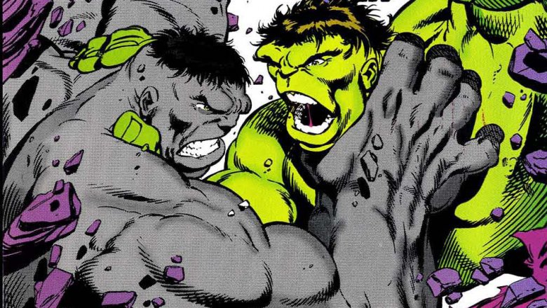
One of the more well-known pieces of comic book trivia is that in his first appearance, the Hulk wasn't green. He was gray, in keeping with Stan Lee and Jack Kirby's desire to create a monster who, like Frankenstein's, was actually a sympathetic character. Unfortunately, the printing technology of the early '60s and the quality of paper used for comics made gray a difficult color to keep consistent from one page to the next and made for muddy visuals, especially given how much time the Hulk was spending in caves.
In an effort to clean things up, colorist Stan Goldberg settled on green to help the Hulk pop off the page—and to distinguish him from another tragic monster hero that Lee and Kirby had just introduced, the Fantastic Four's orange-skinned Thing. The color stuck, and along with setting up a story years later where a gray Hulk would return with the arrogant personality he displayed in his first appearance, green actually ended up being a much better choice for the character.
While superheroes (including most of Marvel's roster) are usually drawn in bright primary colors like red, blue, and yellow, secondary colors like green and purple are often reserved for villains. By giving the Hulk that color scheme, Goldberg was able to underline the idea that the Hulk was dangerous, a character that a lot of people within that universe would see as a threat rather than a hero. Plus, while his torn-up purple pants have provided readers with almost as many jokes as Superman's trunks, making the Hulk's one article of clothing a drastic contrast with his green skin made it abundantly clear to the folks at the Comics Code Authority that he was definitely not running around naked.
The Crimson Avenger's strange symbol
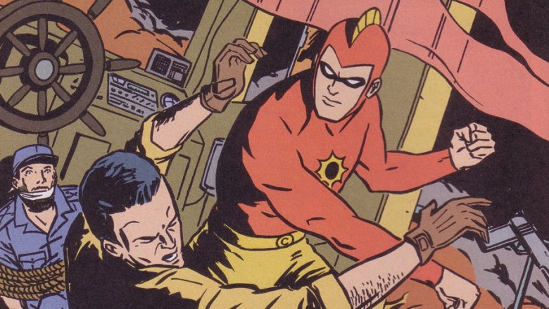
Not many readers are familiar with him today, but the Crimson Avenger holds a pretty significant place in the history of superheroes: he was DC's very first masked vigilante, making his debut in Detective Comics #22, five issues before Batman. To be fair, though, he wasn't that original as a character. Like Bob Kane and Bill Finger would do with Batman later, Jim Chambers lifted heavily from popular pulp characters, combining the look of the Shadow with a civilian identity (and kung-fu sidekick) that was more than a little reminiscent of the Green Hornet.
As superheroes grew in popularity, though, Lee Travis ditched his Shadow-esque slouch hat and trenchcoat for a more standard superhero outfit that included some elements, like a fin on his head, that remain inexplicable to this day. The most prominent one, though, was a black-and-yellow sunburst design on his chest that was never really addressed in the Golden Age.
Decades later, though, Geoff Johns and Peter Snejbjerg finally solved the mystery. In JSA #37, after introducing a new Crimson Avenger, they tied his shift from "mystery man" to "superhero" to a pair of cursed handguns that had a thirst for vengeance, and marked those who used them with a bleeding wound on their chest. It turned out—according to Johns, at least—that what everyone had mistaken for a sunburst was actually something else: a bullet hole.
Firestorm: hello, fellow teens
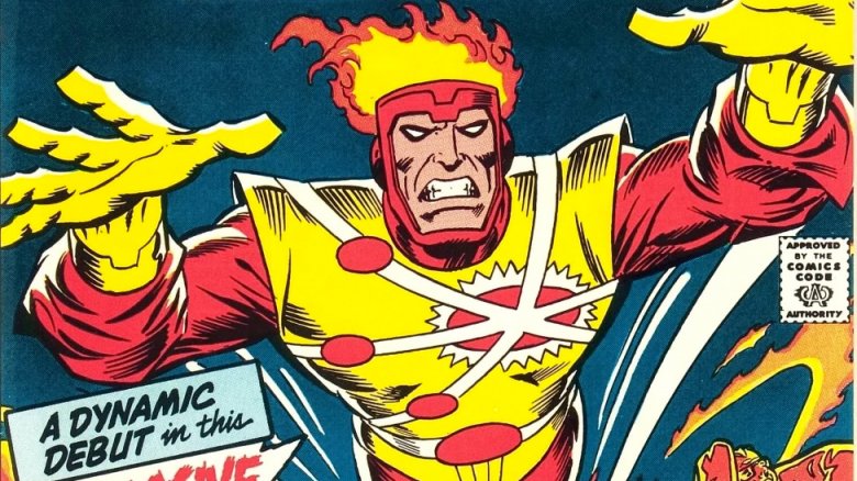
Whether you love it or hate it, Firestorm's costume is definitely one of the most memorable suits the comics have ever seen. It has a ton of over-the-top elements, from wild touches like flaming "hair" and big blousy sleeves to the off-center logo that's meant to represent an atom splitting. It's the kind of costume that makes you wonder just how the artist even got to this point, but in the case of Firestorm, we know exactly how it happened.
In Firestorm's first appearance, once a nuclear accident fuses teenager Ronnie Raymond and scientist Martin Stein, Firestorm shows up completely naked in the middle of a nuclear meltdown—an origin story that manages to combine several recurring nightmares into one. He's got his flaming hair, but the rest of the costume comes as a result of Firestorm's ability to manipulate matter, meaning that the in-canon costume designer is Ronnie Raymond himself, a high school kid who, quite frankly, isn't that bright.
In an installment of the "Ask the Answer Man" column that ran alongside the letters pages in DC Comics, Bob Rozakis was once asked about the inspiration for the costume. His answer was pretty simple: artist Al Milgrom just tried to imagine a costume that a 15 year-old would think was cool, and settled on something that mashed up all kinds of design elements to create the beautiful red-and-yellow disaster that you see before you. It worked, too—the costume was such a hit with readers that it's managed to survive to this day, including a live-action version that can be seen on TV's Legends of Tomorrow.
Mr. Terrific always plays fair
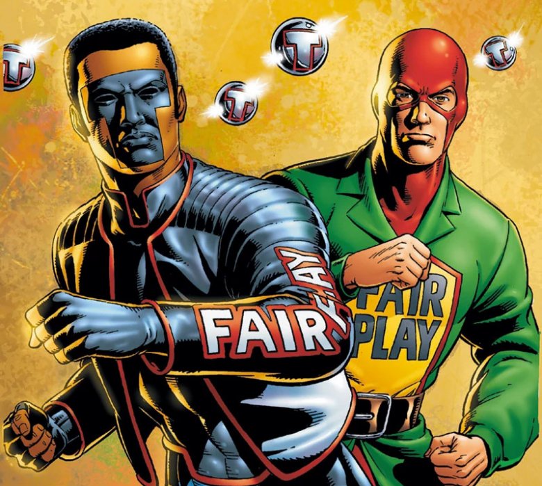
When Terry Sloane became the original Mr. Terrific in 1942, he emblazoned his uniform with the words "Fair Play" because he believed in playing fair. Sometimes it's not that complicated.
Okay, so there's a little more to it than that. If you ever go back and read Mr. Terrific's first appearance, you might be surprised to find out how much of that story is built around Sloane wanting to kill himself. Born with a photographic memory, a brilliant mind, and physical gifts that made him a star athlete, Sloane accomplished everything a person could be asked to do by the time he was 20, and was left with the feeling that life held nothing more for him. Before he could throw himself off a bridge to experience death, however, he wound up saving the life of someone who had fallen, and realized he could put his talents to use by helping people. Even with that newfound heroic attitude, though, Sloane kept the guilt of feeling like he'd been born with advantages that other people simply didn't have.
Sloane's motto in turn inspired the Modern Age Mr. Terrific, Michael Holt, but with a twist. Like his predecessor, Holt was brilliant and physically gifted—a technologist, Olympic gold medalist, and martial artist whose abilities rivaled Bruce Wayne's—and while he was similarly suicidal, his feeling was that life hadn't been fair to him. For all his talents, he couldn't prevent his wife and child from dying in a car accident. By taking up Sloane's mission himself, he was dedicated to preventing those unfair tragedies from happening to others—hence keeping the "Fair Play" logo as part of his costume.
It's worth noting that the Modern Age Mr. Terrific costume can be seen on TV's Arrow in a form that's pretty accurate to the comics—"Fair Play" and all. On that show, though, the explanation is that Curtis Holt has adopted the jacket and name of his favorite pro wrestler, a babyface who was so good that he never had to swing a steel chair to win a match.
Judge Dredd's over-the-top Americana
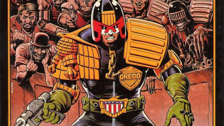
While most costumes manage to reach iconic status by being sleek, streamlined, and easy to recognize, John Wagner and Carlos Ezquerra's Judge Dredd has pulled it off by going in the complete opposite direction. His uniform—along with the uniforms of every other Judge in the thankfully distant future of Mega City One—is so memorably awesome precisely because it's so complicated.
One of the earliest ideas introduced in the Judge Dredd comics is that its particular dystopia is so overwhelming that just existing in it can cause your mind to snap under the pressure, turning otherwise average citizens into future-shocked "Futsies." As living symbols of that future, the Judges' uniforms are just as overloaded as everything else. The massive badges, connected to zippers by equally massive chains, the helmets that hide their eyes to them into faceless soldiers of a fascist police state, and the massive golden eagles on their belts and shoulders that indicate the Judges' rise from the ruins of the United States government, are all indicators of the uniquely American dystopia, seen through the eyes of British creators.
What's really cool about this costume, though, is how all those little touches are changed and reflected for other characters. Cadets, for instance, lack the "Full Eagle" that Dredd wears on his shoulder, and the Chief Judge wears a massive golden eagle badge that's the size of their torso. Even cooler is the way that his undead enemy Judge Death twists these elements into horror, replacing the eagle with a desiccated bat-creature, and swapping out the ribbed shoulder pad for one decorated with bones.
The real reason for the Ninja Turtles' multicolored masks
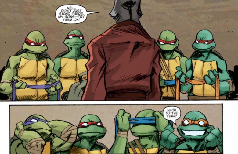
If you were around for the explosion of popularity that made the Teenage Mutant Ninja Turtles a household name in 1987, you may recall that in the original comics, the Turtles all wore red masks. On the cartoon, however, they were each given a distinct color to help kids tell the difference between otherwise identical character designs. Since the cartoon propelled the franchise into being one of the most popular things in the world, the idea stuck, with only Raphael keeping the original red mask throughout.
When TMNT co-creator Kevin Eastman rebooted the franchise along with Tom Waltz and Dan Duncan at IDW, though, they were able to provide an in-continuity reason for both—and it's a weird one even by the standards of a comic built around, well, Teenage Mutant Ninja Turtles. It turns out that the Turtles and Splinter aren't just mutants, they're reincarnated from a family of ninja that were killed by Shredder back in feudal Japan, which is honestly as good an explanation as any for how four turtles can have a rat as their dad. Naturally, each of the Turtles wears the mask that was their favorite color when they were alive.
When they first appear, though, they're all wearing red. That's because when the turtles were first mutated, Raph—who had always been depicted as a loner—was separated from the others and went missing. As a reminder of their mission to rescue their lost brother, the Turtles wore his favorite color until he was located, and were then given permission to wear their own favorites as a sign of their individual strengths. So really, it's all just down to past lives, scientific mutagen, ninja tradition, and advertising. Simple, right?