Bob Budiansky On The Legacy Of Jim Lee's X-Men Trading Card Art - Exclusive Interview
We may receive a commission on purchases made from links.
Jim Lee, now the DC Comics' CCO, is easily one of the most popular and pivotal comic book artists in the medium's history. After getting his start at Marvel in 1987, he quickly rose to prominence for his gorgeous, dynamic, and extremely thoughtful work in the medium. While Jim's won a number of awards and gained many accomplishments in his storied career, early on he became nearly synonymous with Marvel's X-Men (and related offshoots).
This legacy began with his attachment to the series "The Uncanny X-Men." Along with its 1991 spin-off "X-Men" (whose first issue still holds the Guinness World Record for "Best-selling comic, single edition), the series catapulted Jim and the X-Men to legendary status. Hot off his "X-Men" successes, Jim became attached to another project that, like his pivotal work on Marvel's famous mutants, hit the stratosphere.
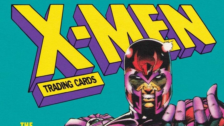
In 1992, Marvel Entertainment commissioned Lee to create the art for a new set of X-Men trading cards that would become one of the most famous in Marvel history. In a new visual and literary tribute to that set of cards, you can now purchase "The Uncanny X-Men Trading Cards: The Complete Series," collecting Jim Lee's top tier work in one place. In an exclusive interview, we spoke with Bob Budiansku, Marvel writer and the trading card series' editor, about working with Lee, the legacy of the set, and more.
Jim was the perfect combination of drawing ability and storytelling
Bob, I loved your introduction. It was so vivid and really gave a nice picture of the times. When Jim Lee came onto pencil "The Uncanny X-Men" in the early '90s, you mentioned that sales skyrocketed. Why do you think his artwork for that title connected so much with people?
Anybody who grew up reading comics in that era was very aware of Jim Lee. He came along and he developed rapidly into arguably the top artist of that time as far as fans were concerned, certainly as far as Marvel was concerned. That's why Marvel gave him the [eventual] top-selling book, "X-Men." They even went ahead and launched a brand-new "X-Men" book to take advantage of the fact that Jim wanted to do it. What made Jim special? By that point, Jim [had] the perfect combination of drawing ability and storytelling, which are the two most vital aspects of drawing comic books.
What does that mean? First of all, his characters, the way he drew them, they conveyed power. They conveyed emotion, energy. They were dynamic. They sucked you in. They were beautiful to look at. His characters came alive! They were almost jumping out of the page, the way he portrayed them.
They looked great. The men were handsome, the women were beautiful. The villains were appropriately villainous, [with] gnarled features and all sorts of things. He nailed every character, every body language movement, every expression. That, combined with the storytelling ... he knew how to use the characters, follow the plot that he was given or that he eventually wrote himself, and display these characters and events in such a way that the readers were pulled along from beginning to end of each story. He was a force to be reckoned with in that moment, and he was a great artist, still is, and attracted fans right and left to his work.
Asking Jim to draw the cards' imagery was a no-brainer
It's really telling that I can literally picture his artwork from memory from when I was a kid. When you approach him for the cards, what were those discussions like?
It was a long time ago. I don't remember the details, but it was pretty simple. At that time, I was in charge of the Marvel trading cards that Marvel was producing, because Marvel had taken it in-house instead of licensing it to an outside company [...] The idea came up to do an "X-Men" set, and Jim Lee being the superstar artist he had become, especially on "The X-Men," it was the obvious choice to me, a no-brainer. "Let me ask Jim Lee."
However, we can't go around at Marvel — back then, probably now as well — poaching other people's talent, and Jim Lee was the artist on "The X-Men," Marvel's top-selling book. It wasn't my privilege to go over there and say, "Hey, Jim, stop working on 'The X-Men,' work on my trading cards." First, I had to speak to his editor, Bob Harris, and say, "I'd like to ask Jim if he'd like to do these cards."
Bob was a bit nervous about the prospect, because every editor's worst nightmare is his creative talent not meeting their deadlines, and then he has to pull in people to fill in, or whatever it takes to get that monthly comic book out the door. It wasn't something he was necessarily thrilled with, but he knew it was the right thing to do if Jim wanted to do it, since Jim's "X-Men" characters, the way he depicted them, [were] pretty much becoming iconic at that time.
Bob agreed that I could speak to Jim, and then ... I don't remember the conversation, but like I said, it didn't take very long. "Hey, Jim, you want to do an entire set of trading cards about the X-Men?" [...] I know he thought about it, because he did have to juggle in his head doing the "X-Men" comic book, and meeting deadlines that were required of him, as well as trading cards at the same time. He thought about it, but he said yes, so I was very thrilled that he said yes, and that we were going to make it work somehow.
The hardest part of designing the cards wasn't what you'd expect
It was so interesting to read about all the extensive preparation that went into the design of the trading cards themselves. What was the hardest part to get right?
The hardest part to get right was one of the sillier things about the cards. I was working with a staff designer, a book designer, really talented guy named Joe Kaufman, on the design of the cards. We came up with the idea that the characters themselves would be in a frame and we would try to extend the frame as close to the edge as possible, so we could highlight the characters to the utmost degree. Within that frame we were going to situate the 'X' of the X-Men, the X symbol, so getting that X to line up with the width of the frame so it all meshed together was a little bit of a challenge.
Back then, computer skills were very primitive. We're taking a few seconds for a graphic designer on a photo computer to line up that kind of a design, but back then, it really took much more effort than we thought it would to get everything to be the right width, and to line up properly. That was it. Other than that, once we had the design and the dimensions and I gave Jim Lee the list of characters, it was off to the races.
He was cranking them out, and I didn't have to look over his shoulder to make sure everything was working correctly. He knew what to do, so that was it. It was a small design element and everything else fell into place, like the idea of putting this Cerebro scan on the back, and so on. One thing after another, we fit it all in and it worked pretty well.
Working with Jim was a breeze
What was it like in practice working with Jim on these, and did he have to change up his work style any for the cards themselves?
Working with Jim was a breeze. He's a great person to work with. He's a real professional, and like I said, he knew what to do. I don't believe we ever ... When I say "we," myself and my editorial staff who did a lot of the trafficking of work back and forth, I don't believe we ever had to tell him, "You drew this character wrong." If Jim needed reference materials, we got him reference[s]. He didn't know every character off the top of his head. He drew the X-Men, and this was the extended X-Men family, so there were lots of the characters from other "X-Men" books. Whatever he needed, we provided him.
We had a schedule and he turned in ... this is a long time ago, 30 years ago, he turned in when he had to turn in. Maybe he was late on schedule occasionally and he would catch up, but it's all ancient, forgotten history. He was very easy to work with. He knew what he was doing. Everything he turned in was wonderful. We were always excited at the office to receive the latest batch of trading card artwork that he was turning in because we knew it was going to be wonderful, so we were looking forward to it and he never disappointed.
His work was so great, it's lovely to hear about this actual experience. Do you have any favorites of the cards that you recall?
I reviewed the cards before this interview; it's been a while. I like them all. They're all my favorite cards. I don't want to say ... I don't think they're any clunkers in the whole batch. They're all really nice, but a few that stood out for me. My favorite is Rogue, as a single character leaping through the air, this really graceful movement on her part, and it's full of power and grace. She looks wonderful. She's drawn beautifully.
What really makes the card exceptional, not to take anything away from what Jim Lee put into drawing Rogue, was the really beautiful atmospheric background that was entirely created by Paul Mounts, the colorist. If you look at that card, it's full of these orange and purple cloudy effects in the background, and it really accentuates Rogue's character in the foreground. Paul Mounts created this perfect backdrop to play up the Rogue character, so that's probably my favorite because it's so beautiful. Aside from that, a few other characters that stood out [are] a few other cards.
Magneto just exudes power
I love that one! Any others?
One was really a little offbeat character from X-Factor named Strong Guy. I don't even know if he's around anymore, but he's this huge bulky guy. He was a happy-go-lucky, free spirit guy. [On] that particular card, Jim Lee drew him on what looked like a tropical island with palm trees, with Polaris, another member of X-Factor who's tiny compared to Strong Guy, perched on his bicep. She's a parrot almost, but she's Polaris, and she looks terrific in that scene, and there's this tropical background. The whimsical nature of it, the juxtaposition of those two characters really made that card for me.
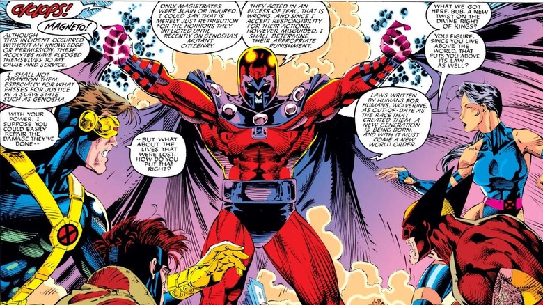
Perhaps more traditionally among the villains, Magneto is my favorite card because he just exudes power, just the way you want Magneto to look in any particular situation. [See Jim Lee's work above, from "X-Men (1991), #1"] If you had to pick one single representative image, this is it. You don't even see his face. He's a couple of eyes beneath the helmet, but his body language and what's going on around him, the metal objects are whirling around him... makes the perfect Magneto image. I like that.
There's a character named Mojo who's like a fat, blob-ish character [...] and Jim brought the correct level of menace and insanity to his expression. It really drew me in as a very compelling image of that particular character. Those are among the ones that stand out for me.
I'm glad you brought up Paul, because one of my next questions was about Paul's work. He used some interesting methods, and I was hoping you could talk about them!
The method he was using wasn't that unusual, [but] perhaps the media that he wound up using was unusual. The method he was using was something called Blue Line Coloring. At that time, before computer coloring came along (which was much more sophisticated than the coloring of that era and the comic books that I grew up with), comic books were limited to a very ... they had a very limited palette.
If you know of comic books pre-computer age, you could look at the little dots on them, and there's different shades of red and blue and yellow. It's very limited. When it came to higher-end projects, which were coming online more and more in the '80s, and then the '90s, this new process [...] called Blue Line Coloring came along.
Paul Mounts' coloring was phenomenal
Can you explain the process?
Budiansky: Blue Line Coloring meant that you would take the black-and-white artwork, you would make a copy of that on a clear acetate overlay. Then you would also print it on a board that could be colored with color medium, whether it's watercolor or gouache or whatever. On that would be a fainter blue line image of the exact same image, and then once it was all colored, ... The actual color layer was mechanically peeled off the board and then combined and registered to the black line acetate overlay.
You'd have eventually one combined image, color and black line. It would still have that traditional comic book look, but much more sophisticated coloring because the colorist was not limited to that limited palette you see on the inside of old comic books. That's the method that Paul Mounts was providing for us, which was fine. It's what we wanted — a more sophisticated color palette than the usual comic books.
What he also did ... I didn't even know this until I interviewed him for the "X-Men Trading Card" book. He was saying, "I used cotton balls, and I used cut-out paper from stationary stores and wrapping paper." He used all sorts of things, whatever worked, whatever made the job, whatever brought it to the goal that he was trying to achieve for that particular image, that's what he did.
At the time my office was in New York City, Marvel's office was in New York City, and Paul was perhaps in Chicago. It wasn't like anybody from my office was standing over his shoulder, watching how he applied his colors. All we knew was the results were phenomenal. We'd worked with him before, and clearly he was experimenting with new techniques to make the coloring even more exciting than previous work that he had done with us because he'd worked on other trading card sets prior to the "X-Men" set for us. I don't care how he got there, the point is he got there and he turned in this beautiful, rendered work. The coloring was phenomenal.
Jim was able to capture the definitive image of whoever he was drawing
Absolutely, it was so beautiful! I also wanted to talk to you about the legacy of the cards. As I mentioned, I had some, [and] I knew so many people that did. They were very exciting. What's Jim's secret?
Jim was able to capture the definitive image of whoever he was drawing. In that single image, or in a case of a team group, a single image of a bunch of characters, with one drawing of that character, he was able to capture ... he was able to tell a story about that character, who that character is.
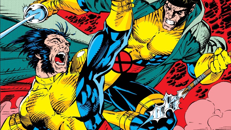
When Wolverine is charging at you in that single image of the Wolverine character, you can feel Wolverine [See Jim's Wolverine above, from "The Uncanny X-Men" Vol. 1, #277]. You know what he's all about. He's this rage machine full of power and ready for action and ready to take on any opponent and so on and so forth. In one single image, he was able to really bring you in.
When I say "you", I mean the fan who's looking at that card. Get them to the point of thinking, "I want to know more about that character. I want to know more about all the other characters in this set, because look how exciting this guy or this woman is." He had that ability to capture his audience, and in the case of trading cards, in a single image. That's a wonderful talent to have. He had it, and he still does.
"The uncanny X-Men Trading Cards: The Complete Series" is available for purchase on Amazon and wherever books are sold.
This interview has been edited for clarity.