Movie Posters Fans Absolutely Hated
A well-made movie poster accomplishes many things at once. It shares basic information, like the film's title, who's in it, and when it comes out. Beyond that, it tells you what genre the movie belongs to, and hints at the plot. The best posters go one step further, capturing the mood and atmosphere of the movie, and getting you excited to buy a ticket and sit down in the theater.
A movie poster that's not well-made only does one thing: it makes fans very, very angry. Sure, as the saying goes, there's no such thing as bad publicity. Still, a movie poster is a marketing tool, and instead of attracting customers the following one-sheets simply managed to make everyone angry. As far as first impressions go, well, that's not a great look.
Spider-Man: Homecoming
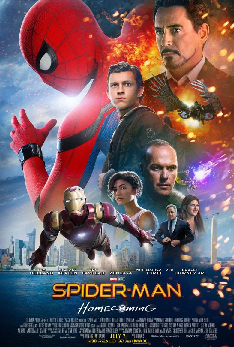
Spider-Man: Homecoming's marketing got off to a great start. First, Tom Holland's Peter Parker made his debut in Captain America: Civil War and almost stole the entire movie. Next, a few teaser posters emerged that showed Spidey crawling up the side of Avengers Tower, hanging from a Brooklyn-Queens Expressway sign, and chilling by the East River. With three simple images, Marvel and Sony let everyone know that this was the laid back, fun, and fully Marvel Cinematic Universe-integrated webslinger we'd been clamoring to see for years. They were perfect.
And then the real poster arrived, and to call it a mess is to be very, very gentle. Spider-Man features prominently, but Iron Man (and his alter ego Tony Stark), a supporting character, occupies almost as much real estate. Actor Donald Glover doesn't appear at all, but the designers found room to feature both the Washington Monument and multiple explosions. Characters appear both in and out of costume for no reason, and nothing flows, making the final product look like a rushed Photoshop job.
Audiences were not kind. Fans mocked the poster on Twitter (and came up with their own, much funnier, variations), while graphic designers and illustrators decried the poster's many technical shortcomings. Why Sony decided that this muddled, busy image should represent a highly anticipated Spider-Man flick remains a mystery, especially considering that some of the alternate options are pretty darn good.
Tomb Raider
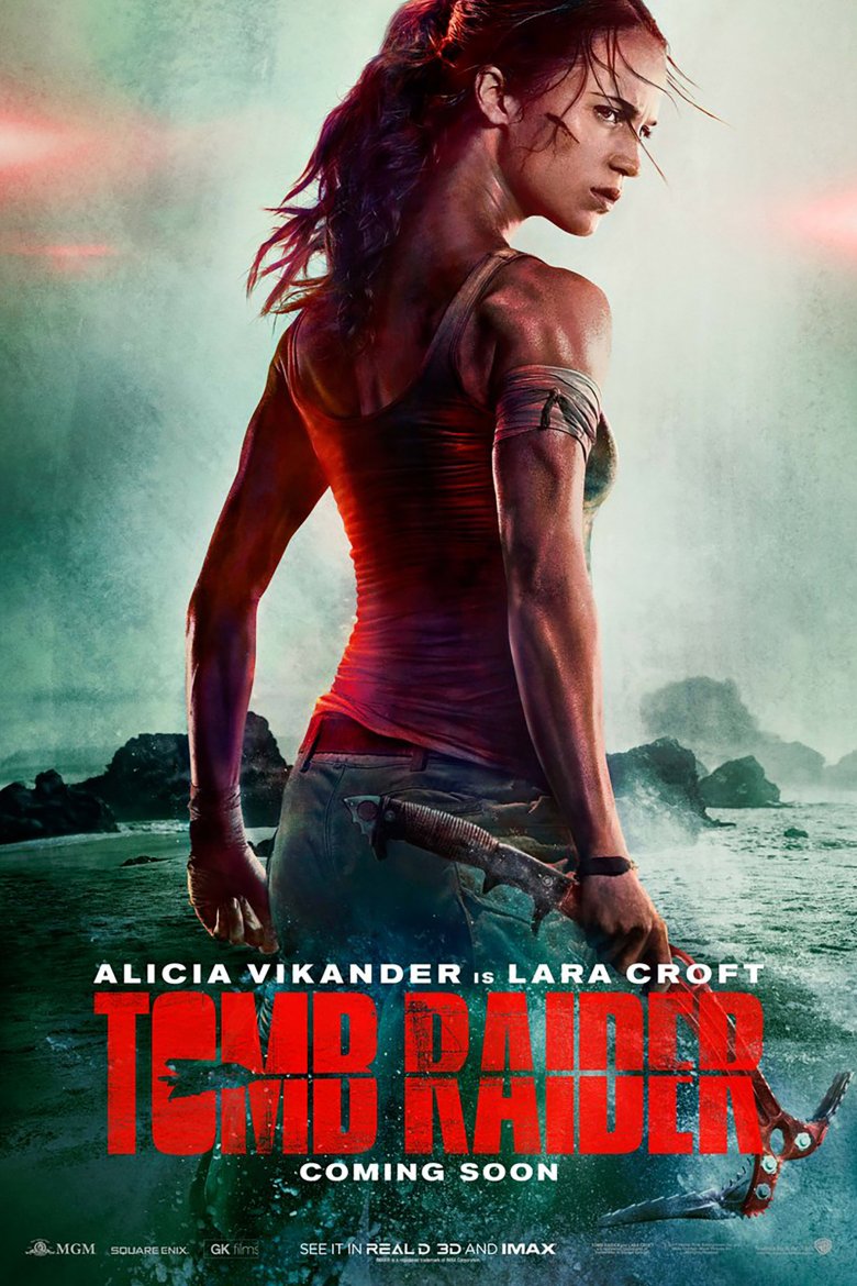
Even if you don't play video games, you probably know Lara Croft, gaming's first big sex symbol who became famous thanks to her large, disproportionately sized—neck? Wait, that's not right.
Tomb Raider's first trailer proves that star Alicia Vikander (Ex Machina, The Danish Girl) is an excellent choice for the role. In the video, Vikander looks and acts exactly like the version of Lara that appeared in 2013's Tomb Raider game reboot, which toned down the hero's sex appeal and ramped up her ferocious determination, rugged vulnerability, and peerless bow-and-arrow skills. This is a Lara Croft that's cunning, smart, and tough, and while she's certainly not hard on the eyes, there's much more to her than her looks.
But you wouldn't know that from the Tomb Raider poster, which transforms Vikander into a long-necked monstrosity courtesy of some poorly done photo manipulation. As some fans note, she looks a little like a velociraptor. We're excited for a film that treats Lara like a human being instead of a shallow pinup, but Tomb Raider's poster makes it impossible to focus on anything other than her appearance. She just looks too weird to think about anything else.
X-Men: Apocalypse
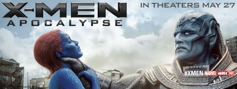
Ask any X-Men fan, and they'll agree that Apocalypse is a bad dude. Still, there are ways to play up your villain's villainy without resorting to cheap shock tactics. Shortly before X-Men: Apocalypse's release, horizontal posters featuring Oscar Isaac's Apocalypse and Jennifer Lawrence's Mystique started appearing in cineplexes and on billboards. That makes sense. Those are two huge stars, after all, and their presence in X-Men: Apocalypse probably went a long way towards getting non-comics fans in theater seats.
It's the context that's a problem. In the heavily criticized poster, Apocalypse's massive hand is wrapped around Mystique's neck, slowly squeezing the life out of her. Yes, Mystique and Apocalypse are both blue mutants, and their respective actors are hidden under pounds of makeup, but the image still shows a graphic scene of man-on-woman violence. It's an odd choice for a PG-13, all-ages superhero romp, and people noticed.
Actress Rose McGowan lead the charge, telling The Hollywood Reporter that "there is a major problem when the men and women at 20th Century Fox think casual violence against women is the way to market a film." The Telegraph followed suit, accusing the poster of misogyny and asking, "Why is it OK to use violence to women as advertisement just because it's superheroes?" To be blunt, it's not, and Fox quickly apologized and removed the poster from circulation.
The Girl with the Dragon Tattoo
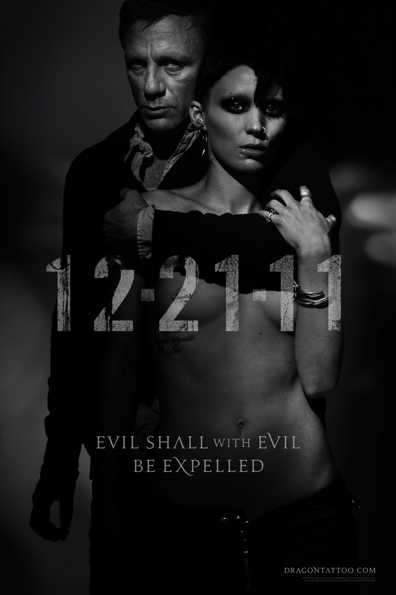
Before The Girl with the Dragon Tattoo became a Hollywood blockbuster, it was a best-selling novel, a critically acclaimed foreign thriller, and the basis for an Emmy-winning TV miniseries. The heroic hacker Lisbeth Salander had legions of fans well before Rooney Mara, Daniel Craig, and David Fincher decided to re-adapt her story, and many of them had very specific expectations about how the character would be portrayed.
The Girl with the Dragon Tattoo's first poster met none of them. It wasn't just that the poster depicted Lisbeth, a staunch feminist, topless while being embraced by a fully clothed Daniel Craig, implying a submissive streak that's completely at odds with the character. It's that Lisbeth Salander is, among other things, a victim of sexual abuse. That's a fundamental part of her character. Author Stieg Larrson claimed he based Lisbeth on a childhood acquaintance, also named Lisbeth, who he saw getting gang-raped by three friends as a teenager (although Larrson's credibility is questionable).
Sexually exploiting a character who's driven to fight back after being sexually exploited is icky, and Dragon Tattoo fans reacted appropriately. According to Entertainment Weekly, some commentators called the poster "sordid," not "cool and sexy," and many fans grew worried that Fincher's adaptation would miss the point of the novel entirely. Not everyone was upset, however. Mara herself defended the poster, telling EW that "It's just a teaser poster" and arguing, "I think had I been doing something incredibly violent on the poster, people wouldn't have had a problem with it."
Avatar
For the most part, Avatar's posters are fine. You've got Zoe Saldana's blue Na'vi warrior, Neytiri, front and center, which makes sense given that Avatar's special effects are the movie's main draw. On some variants, Sam Worthington's human incarnation is there too. He's both the film's star and a handsome fellow, so that's okay. James Cameron's name pops up occasionally, too, which is something a director can get away with when he's promoting his follow-up to the highest-grossing film of all time.
It's not an exciting poster, but it works, at least until you get to the logo—and, more specifically, the font. As far as typefaces go, Papyrus isn't quite as hated as Comic Sans, but it's close. It's kitschy, boring, and constantly used in inappropriate contexts. Graphic designers hate it. Entire websites exist devoted to tracking Papyrus abuse. The font's creator, Chris Costello, admitted to CBS News that Papyrus is probably "overused."
And remember, Avatar cost its studio over $150 million in marketing costs alone. Someone got paid big bucks to type out the movie's title and slap it on a poster. It isn't just uninspired. It's downright lazy. People still haven't forgotten, either. In 2017, eight years after Avatar hit theaters, Saturday Night Live aired a sketch skewering the film's Papyrus-heavy logo. Some things are simply unforgivable. Papyrus is one of them.
Nina
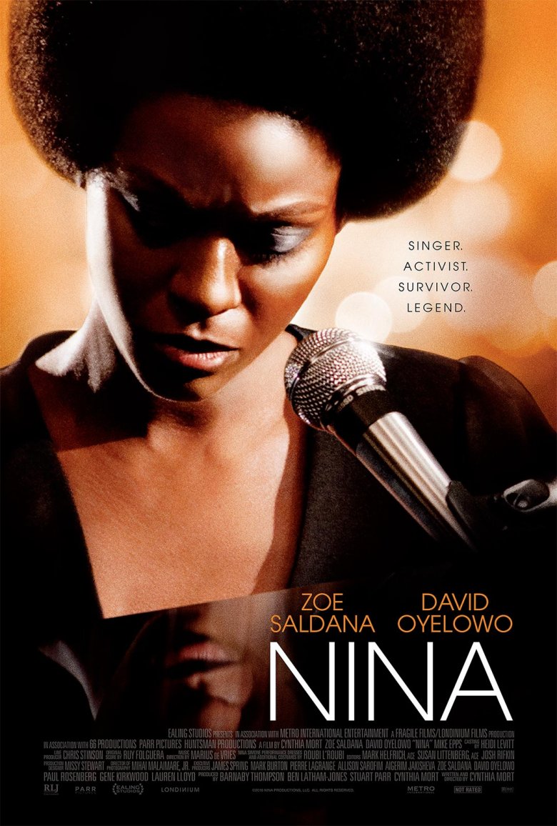
Zoe Saldana's turn as musician and civil rights Nina Simone icon was doomed from the very beginning. In short, Saldana just doesn't look right. While Saldana has relatively fair skin and is, by Hollywood standards, conventionally attractive, Simone's story involves her struggle to succeed in an industry that stigmatizes darker skin, frizzy hair, and, as one commenter said, her "thick features."
"My mother was raised at a time when she was told her nose was too wide, her skin was too dark," Simone's daughter told the New York Times in 2012, when Saldana was first cast in the role. "Appearance-wise this is not the best choice." On-set photos that showed Saldana in a wig, prosthetics, and dark make-up emerged did little to quell the controversy.
Still, as time went on, Nina sat on the shelf, unreleased, and most people forgot about the movie. When the film's poster arrived four years after filming, the entire argument resurfaced. Simone fans compared Saldana's makeup to blackface, and led many people to wonder why Hollywood didn't cast an actor who more naturally resembled Simone, like Viola Davis or Simone's alleged favorite, Whoopi Goldberg. Of course, the poster isn't Nina's biggest problem. When the film finally came out, critics slammed it—the film only has a 2 percent rating on Rotten Tomatoes—making the whole exercise an unmitigated disaster.
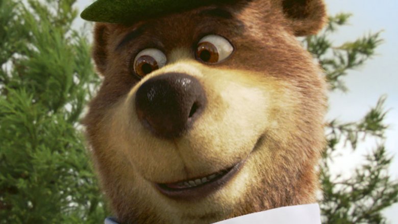
Yogi Bear
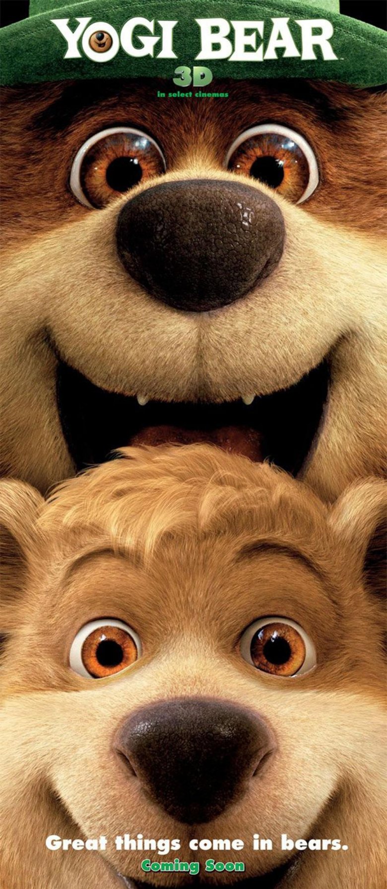
You know what most people expect from a Yogi Bear movie? Some mischievous wildlife. Angry park rangers. The theft of multiple pic-a-nic baskets. Overall, just good, wholesome, family entertainment.
By all indications, that's what 2010's live-action Yogi Bear film is (well, "good" is debatable). You wouldn't know it from the poster, however, which shows Yogi standing behind his sidekick, Boo-Boo, in what could interpreted as a compromising position, both characters smiling wildly. The tagline reads, "Great things come in bears."
If your mind went straight to the gutter reading that, you're not alone. Buzzfeed, The Huffington Post, Collider, and numerous other outlets immediately picked up on the tagline's (supposedly) unintentional double entendres ("bear" is a common slang term in the gay community, and as for the rest, that's what Urban Dictionary is for). Some people were amused. Others, rightfully grossed out. Everyone agreed, however, that the poster was inappropriate for a film geared towards young children.
That Yogi Bear was marketed more like a teen sex comedy than a cartoon spinoff didn't keep audiences away, however: while Yogi got off to a slow start, the movie showed surprising endurance, and went on to become a minor box office hit.
mother!
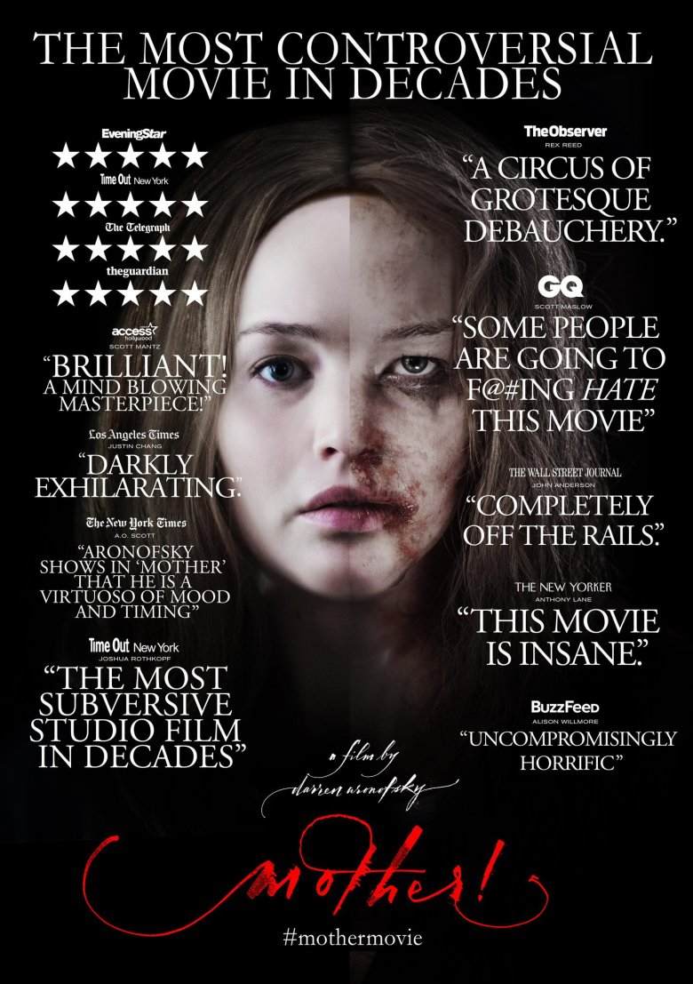
Audiences either love or hate (or love to hate) Darren Aronofsky's mother!, a bizarre psychological horror-drama about a married couple, their unwelcome house guests, and an emerging cult. The film, which trades in allegory and some very, very violent images, has polarized fans, who think it's either a masterful work of art or, as the National Review puts it, "the vilest movie ever released by a major Hollywood studio."
Shortly after release, Paramount Pictures decided to double down on the film's divisive reception with a brand new poster that championed mother! as "the most controversial movie ever made." In true mother! fashion, even that poster is controversial. The main image, which splits Jennifer Lawrence's face in two, with one side beaten and battered and the other untouched, didn't sit well with many members of the public.
Even people who liked the movie called the poster, which evokes domestic violence, "atrocious." A journalist argued that, no matter what your opinion of mother! is, "the fact that a woman gets beat up in it shouldn't be the selling point." Naturally, Paramount hasn't commented on the poster's divided reaction, although they did stick up for the film itself. Given how the poster gleefully banks on how contentious mother! seems to be, however, it looks like Paramount is getting exactly what it wanted.
Star Wars: The Force Awakens

The Force Awakens' official American poster is exactly what you'd expect. Like previous Star Wars posters, it features a painterly collage highlighting most of the main cast. Lead characters Rey and Finn get a big spotlight, while Kylo Ren, the film's main villain, lurks ominously in the background, just like other Star Wars baddies. Han Solo gets a plum spot, as he deserves, and some spaceships and stormtroopers round the whole thing out.
The Chinese Force Awakens poster is almost exactly the same, but there's one key difference: instead of being front and center, as befits a character with a starring role, Finn is absolutely tiny. He's just a little bit bigger than Captain Phasma, who only appears in a handful of scenes and ends the movie stuck in a trash compactor. He's dwarfed by General Leia, who only has a few minutes of screentime.
As far as anyone can tell, the only reason Finn was shrunk is because John Boyega, who plays him, is black. That's what Star Wars fans on Twitter argue, anyway, and they seem to have a point: Poe Dameron and Maz Kanata, who are both played by actors of color, were cut from the poster entirely. The Force Awakens might take place a long time ago in a galaxy far, far away, but racism doesn't have any place in the Star Wars universe or any other. For shame, Disney. For shame.
The Heat
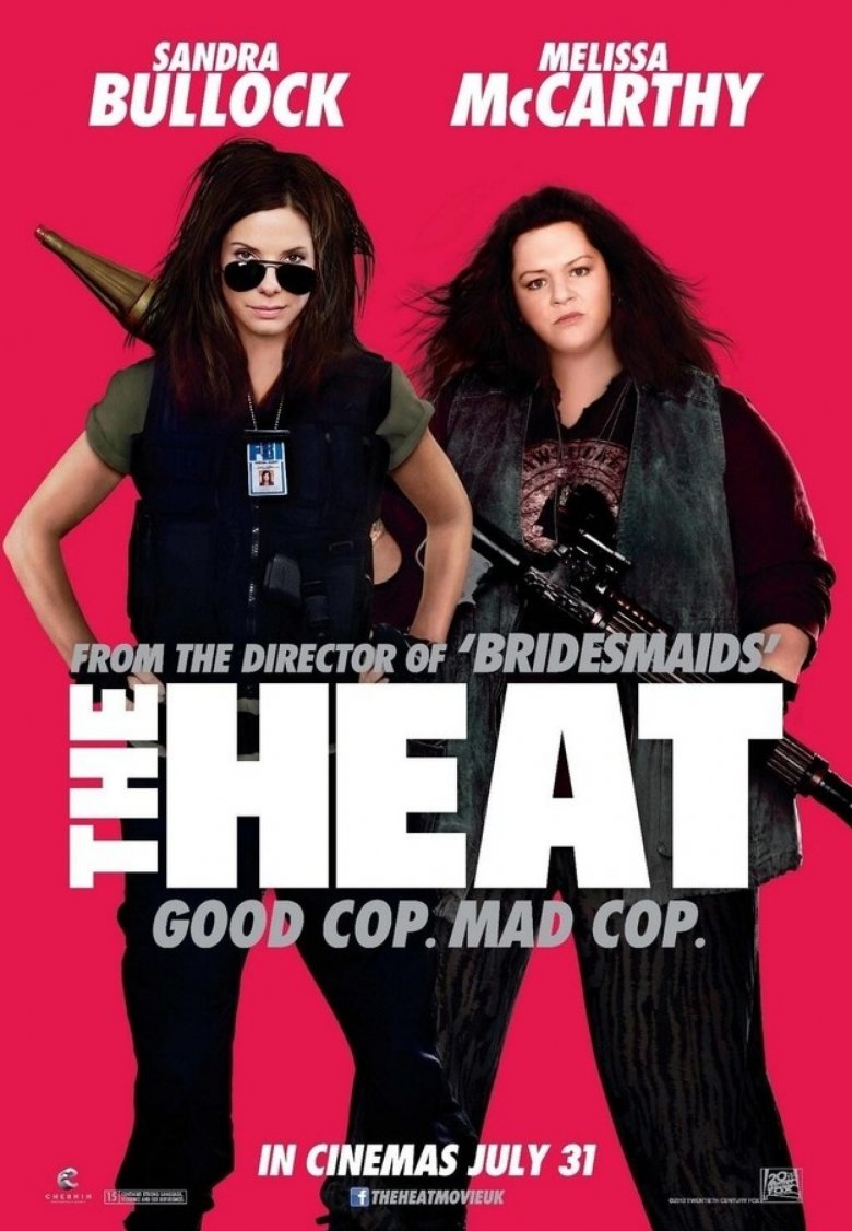
Look at the United Kingdom's poster for The Heat and, without looking at the credits, see if you can figure out who the two stars are. On the left, that's clearly Sandra Bullock rocking the shades and tactical vest. But who's that skinny, unrecognizable woman on the right?
Surprise! It's none other than Bridesmaids actress and Sean Spicer surrogate Melissa McCarthy. She just looks a little different, thanks to a Photoshop-assisted weight loss program that shaved an estimated 30 pounds off the actress and made her look entirely different in the process. Naturally, McCarthy's fanbase didn't react well to the poster's implicit body-shaming. On the UK show business blog The Shiznit, one commentator noted that McCarthy is "plus-sized and proud," and that while the photo manipulation itself is shoddy and unprofessional, "the intention behind it is downright nasty." Others tended to agree.
McCarthy, however, handled the controversy with her trademark sense of humor, jokingly blaming her husband for the weight reduction. "We had a big fight about it because I said I wanted it 80 percent smaller and he said he wanted it 70 percent," McCarthy told The Hollywood Reporter. On her next poster, McCarthy added, she might as well be headless entirely. Honestly, it'd look less weird.